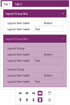
WPF LayoutControl Overview
RadLayoutControl is a flexible component that allows you to arrange visual elements inside its boundaries. Thus helping you to create complex layouts that can be rearranged at runtime.
The RadLayoutControl is part of Telerik UI for WPF, a professional grade UI library with 160+ components for building modern and feature-rich applications. To try it out sign up for a free 30-day trial.
Key Features
Complex layouts: With RadLayoutControl you can create complex compositions that can be easily rearranged and resized according to the available size of the control.
Runtime layout customization: You can customize the layout at any given point in time while the application is running. You can rearrange the items, delete, resize, etc. You can read more about this in the Edit the Layout help article.
Items nesting: You can nest layout items inside one another which gives you very flexible control over the arrangement of the layout.
Layout groups: The control provides you with few types of layout groups which have different visual representation. You can read more about this feature in the Layout Groups section in the documentation.
Save and load the layout: This feature allows you to save the current state of the layout. You can read more about it in the Save/Load Layout help article.
Toolbox: The toolbox allows you to easily add items to the layout via drag/drop. You can also use it to keep track of the deleted items, and the hierarchical structure of the layout. You can read more about this in the ToolBox documentation section.
You can find examples that demonstrate RadLayoutControl in our demo application.
Telerik UI for WPF Support and Learning Resources
- Telerik UI for WPF LayoutControl Homepage
- Get Started with the Telerik UI for WPF LayoutControl
- Telerik UI for WPF API Reference
- Getting Started with Telerik UI for WPF Components
- Telerik UI for WPF Virtual Classroom (Training Courses for Registered Users)
- Telerik UI for WPF LayoutControl Forums
- Telerik UI for WPF Knowledge Base