Visual Structure
This article describes the visual elements of the RadLayoutControl and defines terms and concepts that are used in the scope of the control and its documentation.
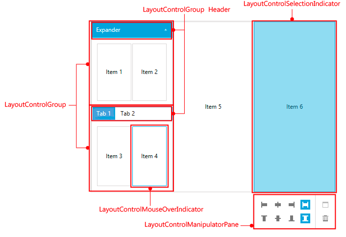
Figure 1: The visual structure of RadLayoutControl

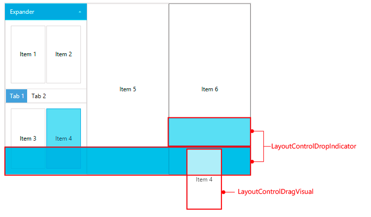
Figure 2: The visual elements involved in the drag/drop operation

LayoutControlGroup: This is a control which is used to group UIElements or other LayoutControlGroups. There are several types of layout groups. You can find more information about this in the Layout Groups section in the documentation.
LayoutControlManipulationPane: This element allows control over the properties of the selected item when the control is in edit mode.
LayoutControlSelectionIndicator: This element indicates which item is selected when the control is in edit mode. Also, it allows resizing over the selected item.
LayoutControlMouseOverIndicator: This element indicates the item under the mouse (the hovered item) when the control is in edit mode.
LayoutControlDragVisual: This element gives visual feedback about the dragged item.
LayoutControlDropIndicator: This element gives visual feedback about the available drop positions in the layout panels. Each available drop position is represented by a different LayoutControlDropIndicator element.