Create Custom Shape
This tutorial will guide you through the task of creating a custom shape.
In order to create a custom shape control, you need to define a custom control deriving from the RadDiagramShapeBase or the RadDiagramShape class.
With the 2024 Q3 SP1 release, the RadDiagram control requires registering the custom types of shapes, connections, and connectors, in order to deserialize them successfully. Read more about this change here.
When deciding which class to inherit from, you need to keep in mind that the RadDiagramShapeBase is the base class of the Diagramming shapes and therefore the RadDiagramShape class derives from it. This is why when you need to create a custom shape, it's common to inherit the base class. However if you need a custom shape exposing a Geometry property, then you'll need to derive from the RadDiagramShape class.
Let's take this step by step:
-
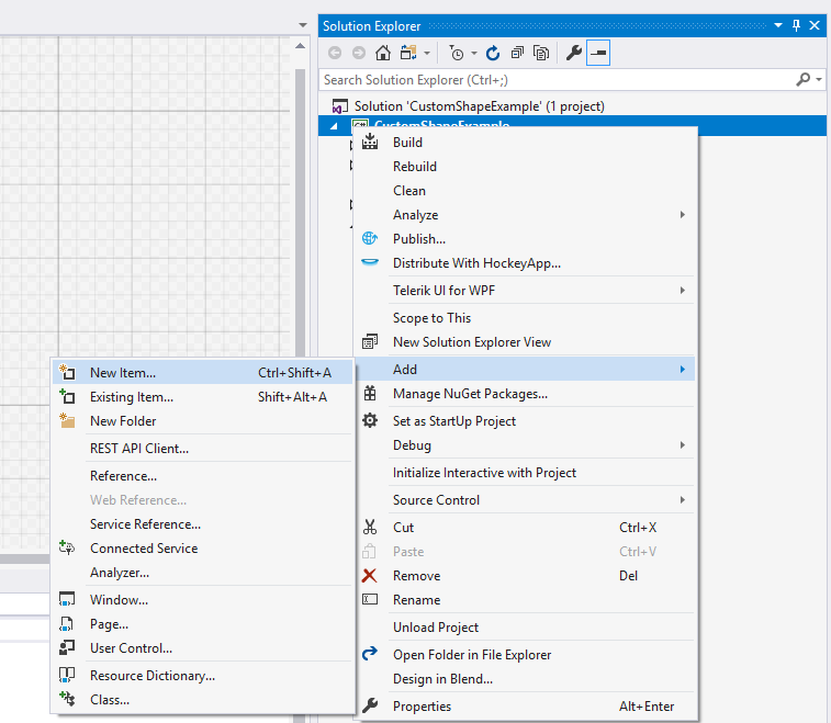
First you need to create a custom control. In order to do so you can use the Visual Studio -> Add New Item... dialog to add WPF Custom Control

Name the new control CustomShape and click OK. This action will create two new files in your application - a class file and a Generic.xaml file with the default style of your custom control.
    public class CustomShape : Control
    {
        static CustomShape()
        {
            DefaultStyleKeyProperty.OverrideMetadata(typeof(CustomShape), new FrameworkPropertyMetadata(typeof(CustomShape)));
        }
    }
<Style TargetType="{x:Type local:CustomShape}"> <Setter Property="Template"> <Setter.Value> <ControlTemplate TargetType="{x:Type local:CustomShape}"> <Border Background="{TemplateBinding Background}" BorderBrush="{TemplateBinding BorderBrush}" BorderThickness="{TemplateBinding BorderThickness}"> </Border> </ControlTemplate> </Setter.Value> </Setter> </Style> -
Change the type of the CustomShape class to derive from RadDiagramShapeBase:
public class CustomShape : Telerik.Windows.Controls.Diagrams.RadDiagramShapeBase { ... } -
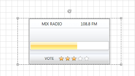
Modify the default ControlTemplate of the CustomShape to better fit your needs. In this tutorial we will create a radio station loading shape which displays the name and frequency of a radio station. It also indicates the current loading process and the rating of the station. Below you can find the custom Style for that shape:
<Style TargetType="local:CustomShape"> <Setter Property="BorderThickness" Value="4" /> <Setter Property="BorderBrush" Value="#6C666666" /> <Setter Property="Width" Value="355" /> <Setter Property="Height" Value="160" /> <Setter Property="HorizontalAlignment" Value="Center" /> <Setter Property="Margin" Value="0" /> <Setter Property="Background"> <Setter.Value> <LinearGradientBrush StartPoint="0.5,0" EndPoint="0.5,1"> <GradientStop Color="White" /> <GradientStop Offset="1" Color="#FFEDF4FF" /> </LinearGradientBrush> </Setter.Value> </Setter> <Setter Property="Template"> <Setter.Value> <ControlTemplate TargetType="local:CustomShape"> <Border Margin="{TemplateBinding Margin}" HorizontalAlignment="{TemplateBinding HorizontalAlignment}" BorderBrush="{TemplateBinding BorderBrush}" BorderThickness="{TemplateBinding BorderThickness}" CornerRadius="3"> <Border Background="{TemplateBinding Background}" BorderBrush="#E6FBFDFF" BorderThickness="1" CornerRadius="1"> <StackPanel> <Grid Margin="40 5" VerticalAlignment="Center"> <TextBlock FontFamily="Segoe UI" FontSize="14" Text="MIX RADIO" /> <TextBlock HorizontalAlignment="Right" FontFamily="Segoe UI" FontSize="14" Text="108.8 FM" /> </Grid> <Border Height="90" BorderBrush="#6C666666" BorderThickness="0 1"> <Border.Background> <LinearGradientBrush StartPoint="0.5,0" EndPoint="0.5,1"> <GradientStop Offset="0" Color="#65FFFFFF" /> <GradientStop Offset="0.965" Color="#66E7E5E5" /> <GradientStop Offset="0.609" Color="#9DD9D9D9" /> <GradientStop Offset="0.826" Color="#A5D9D9D9" /> </LinearGradientBrush> </Border.Background> <StackPanel HorizontalAlignment="Center" VerticalAlignment="Center"> <TextBlock x:Name="BufferingPercentageLabel" Margin="0 0 0 15" HorizontalAlignment="Center" FontFamily="Segoe UI" FontSize="13"> <TextBlock.Foreground> <LinearGradientBrush StartPoint="0.5,0" EndPoint="0.5,1"> <GradientStop Offset="1" Color="Black" /> <GradientStop Color="#FF727272" /> </LinearGradientBrush> </TextBlock.Foreground> </TextBlock> <telerik:RadProgressBar x:Name="BufferingProgressBar" Width="270" Height="30" Maximum="100" Minimum="0" Value="60" /> </StackPanel> </Border> <Border Padding="0 5"> <Border.Background> <LinearGradientBrush StartPoint="0.5,0" EndPoint="0.5,1"> <GradientStop Offset="0.07" Color="#7FFFFFFF" /> <GradientStop Offset="0.965" Color="#7EE7E5E5" /> <GradientStop Offset="0.61" Color="#FFD9D9D9" /> <GradientStop Offset="0.826" Color="#FFD9D9D9" /> </LinearGradientBrush> </Border.Background> <StackPanel HorizontalAlignment="Center" Orientation="Horizontal"> <TextBlock Margin="0 0 0 15" HorizontalAlignment="Center" VerticalAlignment="Center" FontFamily="Segoe UI" FontSize="13" Text="VOTE"> <TextBlock.Foreground> <LinearGradientBrush StartPoint="0.5,0" EndPoint="0.5,1"> <GradientStop Offset="1" Color="Black" /> <GradientStop Color="#FF727272" /> </LinearGradientBrush> </TextBlock.Foreground> </TextBlock> <telerik:RadRating x:Name="Rating" Margin="15 0" HorizontalAlignment="Center" Value="3" /> </StackPanel> </Border> </StackPanel> </Border> </Border> </ControlTemplate> </Setter.Value> </Setter> </Style> -
Now that your custom control is defined and its ControlTemplate is customized, you can use it as a shape in your Diagramming drawing canvas:
    <telerik:RadDiagram>
        <local:CustomShape />
    </telerik:RadDiagram>
The local alias points to the namespace of the CustomShape class.
As a result you'll get the following custom shape:

Please note that in case you need to bind the RadDiagram control to a collection of business data and you need to display the business data in a custom shape, then you have to create a custom RadDiagram. In the custom diagram class you need to override the IsItemItsOwnShapeContainerOverride and GetShapeContainerForItemOverride methods to return the custom shape type:
In scenarios where you want to create custom container shapes, you can override the GetShapeContainerForItemOverridem method of the RadDiagram. Inside the method, you can return your custom container shape.
public class CustomDiagram : RadDiagram
{
    protected override bool IsItemItsOwnShapeContainerOverride(object item)
    {
        return item is CustomShape;
    }

    protected override Telerik.Windows.Diagrams.Core.IShape GetShapeContainerForItemOverride(object item)
    {
        return new CustomShape();
    }
}
Public Class CustomDiagram
    Inherits RadDiagram
    Protected Overrides Function IsItemItsOwnShapeContainerOverride(item As Object) As Boolean
        Return TypeOf item Is CustomShape
    End Function

    Protected Overrides Function GetShapeContainerForItemOverride(item As Object) As Telerik.Windows.Diagrams.Core.IShape
        Return New CustomShape()
    End Function
End Class
You can download a sample project from our CodeLibrary.