Getting Started with WPF DataPager
The RadDataPager is a control that allows you to split your data into pages and display it in a user-friendly way. This topic will help you quickly get started using the control.
Adding Telerik Assemblies Using NuGet
To use RadDataPager when working with NuGet packages, install the Telerik.Windows.Controls.Data.for.Wpf.Xaml package. The package name may vary slightly based on the Telerik dlls set - Xaml or NoXaml
Read more about NuGet installation in the Installing UI for WPF from NuGet Package article.
With the 2025 Q1 release, the Telerik UI for WPF has a new licensing mechanism. You can learn more about it here.
Adding Assembly References Manually
If you are not using NuGet packages, you can add a reference to the following assemblies:
- Telerik.Licensing.Runtime
- Telerik.Windows.Controls
- Telerik.Windows.Controls.Data
- Telerik.Windows.Data
You can find the required assemblies for each control from the suite in the Controls Dependencies help article.
Adding RadDataPager
To use the RadDataPager in the XAML you have to add the following namespace declaration: xmlns:telerik="http://schemas.telerik.com/2008/xaml/presentation"
Example 1: Declare a RadDataPager
<telerik:RadDataPager x:Name="radDataPager" />
Configuring the RadDataPager
RadDataPager allows to be configured via the properties it exposes. You can do the following:
Manage the size of the pages via the PageSize property. Read more
Show and hide visual elements of a pager via the DisplayMode property. Read more
Implement infinite paging. Read more
Paging a Collection
To learn more about the use of the Source and the PagedSource properties, please read this topic.
RadDataPager internally uses a QueryableCollectionView for its paging mechanism, which relies on the Skip method. This requires the OrderBy method to be called over the source collection, so that it is sorted.
RadDataPager can page any collection that implements the IEnumerable interface. The only thing that you have to do is to pass the collection to its Source property.
The collection in this example will hold business objects of type Club. You can prepare a simple collection of clubs and pass it to the Source property of the RadDataPager.
Create your RadDataPager and make some basic configurations to it.
Example 2: RadDataPager bound to a collection
<telerik:RadDataPager x:Name="radDataPager"
                      PageSize="5"
                      Source="{Binding Clubs}"/>
After the collection is passed to the Source property, it will get split into pages. In order to learn how to access the paged collection, please read the next section.
Exposing the Paged Collection
Instead of using the PagedSource property you can also wrap your collection in an IPagedCollectionView before passing it to the Source property. To learn more read this topic.
The paged collection inside the RadDataPager can be accessed via the PagedSource property. It exposes the set of data belonging to the current page. Here is an example of a ListBox that displays the data paged by the RadDataPager.
Example 3: ListBox exposing the paged collection
<Grid x:Name="LayoutRoot"
        Background="White">
    <Grid.RowDefinitions>
        <RowDefinition />
        <RowDefinition Height="Auto" />
    </Grid.RowDefinitions>
      <ListBox Name="itemsControl"
               ItemsSource="{Binding PagedSource, ElementName=radDataPager}"/>
    <telerik:RadDataPager x:Name="radDataPager"
                            Grid.Row="1"
                            DisplayMode="All"
                            PageSize="5"
                            Margin="0,10,0,0"
                            Source="{Binding Clubs}"/>
</Grid>
Figure 1: Paged ListBox
Paging RadGridView
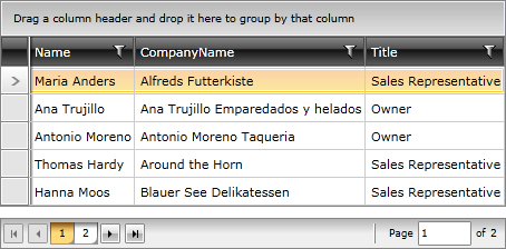
Using the PagedSource property, you can also apply paging to a RadGridView control. You only need to set this source as the ItemsSource collection of the control.
The collection in Example 4 holds business objects of type Employee. You need to pass this collection to the Source property of the RadDataPager. After that, bind the ItemsSource property to the PagedSource collection using ElementName binding.
Example 4: Paging RadGridView
<Grid x:Name="LayoutRoot"
        Background="White">
    <Grid.RowDefinitions>
        <RowDefinition />
        <RowDefinition Height="Auto" />
    </Grid.RowDefinitions>
    <telerik:RadGridView x:Name="radGridView"
                         ItemsSource="{Binding PagedSource, ElementName=radDataPager}"
                         AutoGenerateColumns="False">
        <telerik:RadGridView.Columns>
            <telerik:GridViewDataColumn DataMemberBinding="{Binding Name}" />
            <telerik:GridViewDataColumn DataMemberBinding="{Binding CompanyName}" />
            <telerik:GridViewDataColumn DataMemberBinding="{Binding Title}" />
        </telerik:RadGridView.Columns>
    </telerik:RadGridView>
    <telerik:RadDataPager x:Name="radDataPager"
                          Source="{Binding Employees}"
                          PageSize="5" />
</Grid>
Figure 2: Paged RadGridView

Setting a Theme
The controls from our suite support different themes. You can see how to apply a theme different than the default one in the Setting a Theme help article.
Changing the theme using implicit styles will affect all controls that have styles defined in the merged resource dictionaries. This is applicable only for the controls in the scope in which the resources are merged.
To change the theme, you can follow the steps below:
Choose between the themes and add reference to the corresponding theme assembly (ex: Telerik.Windows.Themes.Windows8.dll). You can see the different themes applied in the Theming examples from our WPF Demos application.
-
Merge the ResourceDictionaries with the namespace required for the controls that you are using from the theme assembly. For the RadDataPager, you will need to merge the following resources:
- Telerik.Windows.Controls
- Telerik.Windows.Controls.Data
Example 5 demonstrates how to merge the ResourceDictionaries so that they are applied globally for the entire application.
Example 5: Merge the ResourceDictionaries
<Application.Resources>
    <ResourceDictionary>
        <ResourceDictionary.MergedDictionaries>
            <ResourceDictionary Source="/Telerik.Windows.Themes.Windows8;component/Themes/System.Windows.xaml"/>
            <ResourceDictionary Source="/Telerik.Windows.Themes.Windows8;component/Themes/Telerik.Windows.Controls.xaml"/>
            <ResourceDictionary Source="/Telerik.Windows.Themes.Windows8;component/Themes/Telerik.Windows.Controls.Data.xaml"/>
        </ResourceDictionary.MergedDictionaries>
    </ResourceDictionary>
</Application.Resources>
Alternatively, you can use the theme of the control via the StyleManager.
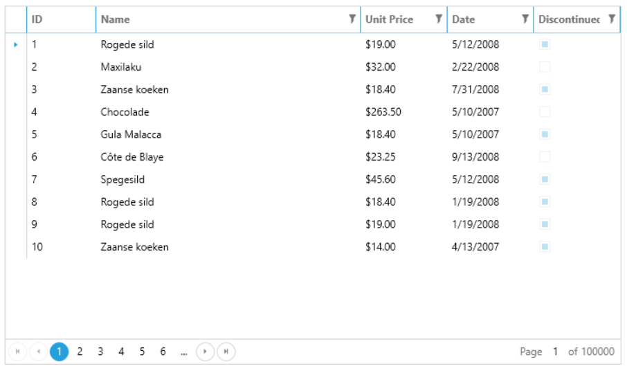
Figure 3 shows a RadDataPager with the Windows8 theme applied.
Figure 3: RadDataForm with the Windows8 theme

Telerik UI for WPF Learning Resources
- Telerik UI for WPF DataPager Component
- Getting Started with Telerik UI for WPF Components
- Telerik UI for WPF Installation
- Telerik UI for WPF and WinForms Integration
- Telerik UI for WPF Visual Studio Templates
- Setting a Theme with Telerik UI for WPF
- Telerik UI for WPF Virtual Classroom (Training Courses for Registered Users)
- Telerik UI for WPF License Agreement