Display Modes
If you are new to the RadDataPager control, you can consider reading the Getting Started topic before continuing.
The RadDataPager allows you to decide which of its visual elements to be visible. This is done via the PagerDisplayModes enumeration and the DisplayMode property.
The enumeration has the following values:
First - the go to first page button is displayed.
FirstLastNumeric - the go to first and last page buttons and the numeric buttons are displayed
FirstLastPreviousNext - the go to first and last page buttons and go to previous and next page buttons are displayed
FirstLastPreviousNextNumeric - same as above, but in addition the numeric buttons are also displayed
Last - the go to last page button is displayed
Next - the go to next page button is displayed
Numeric - only the numeric buttons are displayed
Previous - the go to previous page button is displayed
PreviousNext - the go to previous and next page buttons are displayed
PreviousNextNumeric - the go to previous and next page buttons are displayed, and in addition the numeric buttons are also displayed
Text - only the textbox and the label are displayed
All (default) - all buttons are displayed
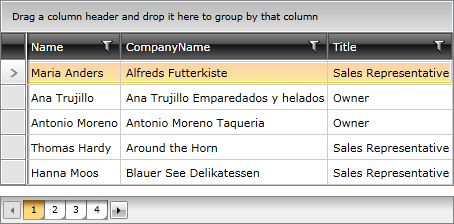
Here is an example of a RadDataPager that displays the previous, next and numeric buttons.
<telerik:RadDataPager x:Name="radDataPager"
                        PageSize="5"
                        DisplayMode="PreviousNextNumeric" />

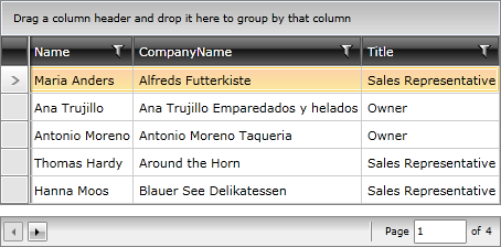
If the combination of visual elements doesn't exist in the enumeration, you can combine one or more enumeration values. This is done by separating the values with a coma. Here is an example:
<telerik:RadDataPager x:Name="radDataPager"
                        PageSize="5"
                        DisplayMode="PreviousNext,Text" />
