Tabs Overflow
When the width of the control does not allow all tabs to be displayed, two scrolling buttons appear to the left and to the right side of the tab items.
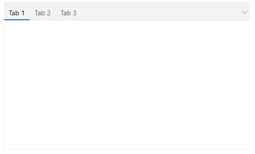
For faster navigation the control exposes a drop down menu which contains a list of all tab items inside the control. To display the dropdown button menu, set the DropDownDisplayMode property of RadTabControl to Visible. The property is an enum providing the following values:
-
Collapsed—The drop down is always hidden. -
Visible—The drop down is always visible. -
WhenNeeded—The drop down is shown only when there is not enough space for the tabs to be arranged.
Show DropDownMenu button
<telerik:RadTabControl x:Name="radTabControl" DropDownDisplayMode="Visible">
    <!-- large number of items -->
</telerik:RadTabControl>

Overflow Mode
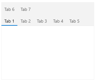
By default, TabControl will display two arrows when the width of the tab items exceeds the available width with which you can bring the rest of the items into view. To change this behavior and show all TabItems into the view, set the OverflowMode property of RadTabControl to Wrap. This mode will transfer all tab items that cannot fit in the available width to a new line.
Show all tab items in the viewport
<telerik:RadTabControl OverflowMode="Wrap">
    <!-- large number of items -->
</telerik:RadTabControl>

The default value of the property is Scroll which brings the left and right scrolling buttons and arranges all tabs on a single line.
Scroll Mode
When the OverflowMode is set to Scroll (default value), you can determine the scrolling behavior. To do so, set the ScrollMode property of RadTabControl. The property is an enum providing the following values:
-
Pixel—Scrolls 16 pixels per button click. -
Item—Scrolls one item per button click. -
Viewport—Scrolls an amount equal to the available viewport width.
Set the ScrollMode property
<telerik:RadTabControl ScrollMode="Item" />