Styling RadRadialMenu Parts
The following article will demonstrate how to style different parts of the RadRadialMenu control.
You can access the RadRadialMenu control parts through alias pointing to the Telerik.UI.Xaml.Controls.Navigation.Menu namespaces: xmlns:menu="using:Telerik.UI.Xaml.Controls.Navigation.Menu"
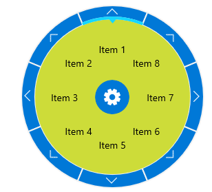
Styling the ContentMenu
To style the content menu you can use the ContentMenuBackgroundStyle property of the RadRadialMenu. You have to set a Style that targets the Rectangle type.
When the ContentSectorBackground property of the RadialMenuItem is set, the menu item will overlay the background of the content menu.
Example 1: Change ContentMenuBackground
<navigation:RadRadialMenu.ContentMenuBackgroundStyle>
    <Style TargetType="Rectangle">
        <Setter Property="Fill" Value="#CDDC39"/>
    </Style>
</navigation:RadRadialMenu.ContentMenuBackgroundStyle>
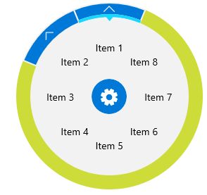
Styling the NavigationMenu
To style the NavigationMenu you can use the NavigationMenuBackgroundStyle property of the RadRadialMenu. You have to set a Style that targets the Rectangle type.
When the menu items have child elements, the NavigationItemButton will overlay the background of the navigation menu.
Example 2: Change NavigationMenuBackground
<navigation:RadRadialMenu.NavigationMenuBackgroundStyle>
    <Style TargetType="Rectangle">
        <Setter Property="Fill" Value="#CDDC39"/>
    </Style>
</navigation:RadRadialMenu.NavigationMenuBackgroundStyle>
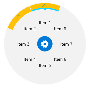
Styling the NavigationItemButton
To change the appearance of the NavigationItemButton, you have to define an implicit style in the Resources of the RadRadialMenu that targets the NavigationItemButton type defined in the Telerik.UI.Xaml.Controls.Primitives.Menu namespace.
Example 2: Style NavigationItemButton
<navigation:RadRadialMenu.Resources>
    <Style TargetType="menu:NavigationItemButton">
        <Setter Property="Foreground" Value="#009688"/>
        <Setter Property="Background" Value="#FFC107"/>
    </Style>
</navigation:RadRadialMenu.Resources>
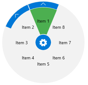
Styling the RadialMenuItem
The RadialMenuItem can be styled via its ContentSectorBackground property.
Example 3: Change ContentSectorBackground
<navigation:RadialMenuItem Header="Item 1" ContentSectorBackground="#4CAF50"/>
You can use the InnerRadiusFactor and the InnerNavigationRadiusFactor properties to control the size of the RadialMenuItem.
Styling the DecorationItemButton
To change the appearance of the DecorationItemButton, you have to define an implicit style in the Resources of the RadRadialMenu that targets the DecorationItemButton type defined in the Telerik.UI.Xaml.Controls.Primitives.Menu namespace.
Example 4: Style DecorationItemButton
<navigation:RadRadialMenu.Resources>
    <Style TargetType="menu:DecorationItemButton">
        <Setter Property="ThicknessFactor" Value="0.2"/>
        <Setter Property="ArrowThicknessFactor" Value="0.6"/>
        <Setter Property="PointerOverBackgroundBrush" Value="Yellow"/>
        <Setter Property="SelectedBackgroundBrush" Value="#4CAF50"/>
        <Setter Property="SelectedPointerOverBackgroundBrush" Value="Orange"/>
    </Style>
</navigation:RadRadialMenu.Resources>
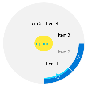
Styling the RadialMenuButton
To change the appearance of the RadialMenuButton, you have to define an implicit style in the Resources of the RadRadialMenu that targets the RadialMenuButton type defined in the Telerik.UI.Xaml.Controls.Primitives.Menu namespace.
Example 5: Style RadialMenuButton
<navigation:RadRadialMenu.Resources>
    <Style TargetType="menu:RadialMenuButton">
        <Setter Property="Content" Value="options"/>
        <Setter Property="FontSize" Value="15"/>
        <Setter Property="Width" Value="60"/>
        <Setter Property="Foreground" Value="LightSeaGreen"/>
        <Setter Property="Background" Value="LightPink"></Setter>
        <Setter Property="FontFamily" Value="Segoe UI"/>
    </Style>
</navigation:RadRadialMenu.Resources>
To place a text inside the Content part of the RadialMenuButton, the FontFamily property needs to be set. For example, it could be set to "Segoe UI".
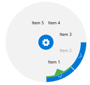
The result is: