Getting Started with WinUI NumericBox
This topic demonstrates how to start using RadNumericBox for .
Assembly References
In order to use the RadNumericBox in your projects, you have to add references to the following assembly:
Telerik.WinUI.Controls.dllTelerik.Licensing.Runtime.dll
Defining a RadNumericBox
You can access the RadNumericBox control through an alias pointing to the Telerik.UI.Xaml.Controls.Input namespace:
xmlns:input="using:Telerik.UI.Xaml.Controls.Input"
Example 1: Adding a RadNumericBox in XAML
<Grid xmlns:input="using:Telerik.UI.Xaml.Controls.Input">
    <input:RadNumericBox Value="5" Minimum="1" Maximum="10" />
</Grid>
Figure 1: Result from Example 1

Watermark and WatermarkTemplate
The Watermark and WatermarkTemplate properties allow you to customize what is displayed when the Value of the control is not set.
Example 2: Setting the Watermark
<Grid xmlns:input="using:Telerik.UI.Xaml.Controls.Input">
    <input:RadNumericBox Watermark="Please, enter a number" />
</Grid>
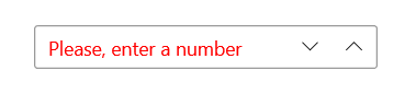
Example 3: Setting the Watermark and WatermarkTemplate
<input:RadNumericBox Watermark="Please, enter a number" >
    <input:RadNumericBox.WatermarkTemplate>
        <DataTemplate>
            <TextBlock Text="{Binding}" Foreground="Red" />
        </DataTemplate>
    </input:RadNumericBox.WatermarkTemplate>
</input:RadNumericBox>
Figure 2: Result from Example 3
Header and HeaderTemplate
The Header and HeaderTemplate properties allow you to customize the header of the control displayed above it.
Example 4: Setting the Header
<Grid xmlns:input="using:Telerik.UI.Xaml.Controls.Input">
    <input:RadNumericBox Header="My number" Value="5">
    </input:RadNumericBox>
</Grid>
Example 5: Setting the Header and HeaderTemplate
<Grid xmlns:input="using:Telerik.UI.Xaml.Controls.Input">
    <input:RadNumericBox Header="My number" Value="5">
        <input:RadNumericBox.HeaderTemplate>
            <DataTemplate>
                <TextBlock Text="{Binding}" FontWeight="Bold" TextDecorations="Underline" />
            </DataTemplate>
        </input:RadNumericBox.HeaderTemplate>
    </input:RadNumericBox>
</Grid>
Figure 3: Result from Example 5

ValueFormat and ValueFormatSelector
The ValueFormat and ValueFormatSelector properties allow you to provide a custom format for the data. The ValueFormatSelector allows you to choose a format depending on the current value.
Example 5: Setting the ValueFormat
<Grid xmlns:input="using:Telerik.UI.Xaml.Controls.Input">
    <input:RadNumericBox x:Name="numericBox" Value="5" ValueFormat="{}{0:C}" />
</Grid>
Example 6: Setting the ValueFormatSelector
public sealed partial class MainPage : Page
{
    public MainPage()
    {
        this.InitializeComponent();

        this.numericBox.ValueFormatSelector = new ValueFormatSelector();
    }
}

public class ValueFormatSelector : Telerik.Core.IFormatSelector
{
    public string GetFormat(object value)
    {
        if(double.Parse(value.ToString()) > 5)
        {
            return "{0:C}";
        }
        else
        {
            return "{0:N}";
        }
    }
}
SmallChange and LargeChange
The SmallChange and LargeChange properties allow for customizing with how much the Value of the control is increased/decreased. The SmallChange is used when scrolling the mouse wheel while the control is focused and also when the up/down arrow keys are pressed. The LargeChange is used when the page up/page down keys are pressed.
Telerik UI for WinUI Learning Resources
- Telerik UI for WinUI NumericBox Component
- Getting Started with Telerik UI for WinUI Components
- Telerik UI for WinUI Installation
- Telerik UI for WinUI Examples
- Telerik UI for WinUI Accessibility
- Telerik UI for WinUI License Agreement