Property Builder
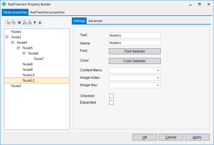
To quickly create and arrange node structure and appearance invoke the Property Builder from the context menu or the Smart Tag.
Figure 1: TreeView PropertyBuilder
Node Properties Tab
Figure 2: Node Properties
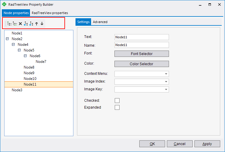
By default you will see an empty tree view where the command buttons allow you to add and arrange nodes. The buttons perform the following actions (in order from left to right):
Add a new root node.
Add a child node.
Delete the selected node.
Make the selected child node a sibling of its parent.
Make the selected node a child of the previous node in the list.
Move the selected node up in the list.
Move the selected node down in the list.
Settings Pane
The Settings pane contains the most commonly used properties for each node (Text, Name, Font, ForeColor and others).
Figure 3: The Settings tab

The Advanced tab contains more properties for each node:
Figure 4: The Advanced tab
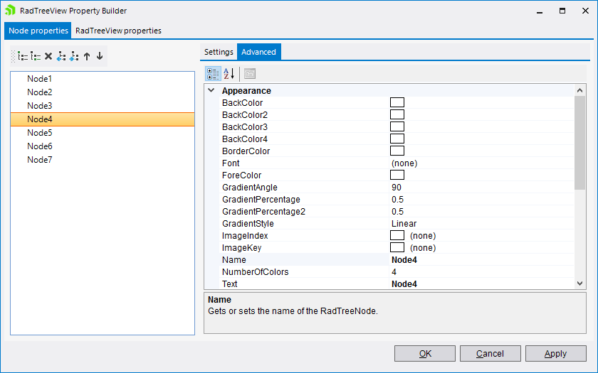
The Advanced tab allows you to set various properties for each node (BackColor, ForeColor, Height).
RadTreeView Properties Tab
This tab on the right side of the dialog allows you to quickly edit significant properties.
The available items are:
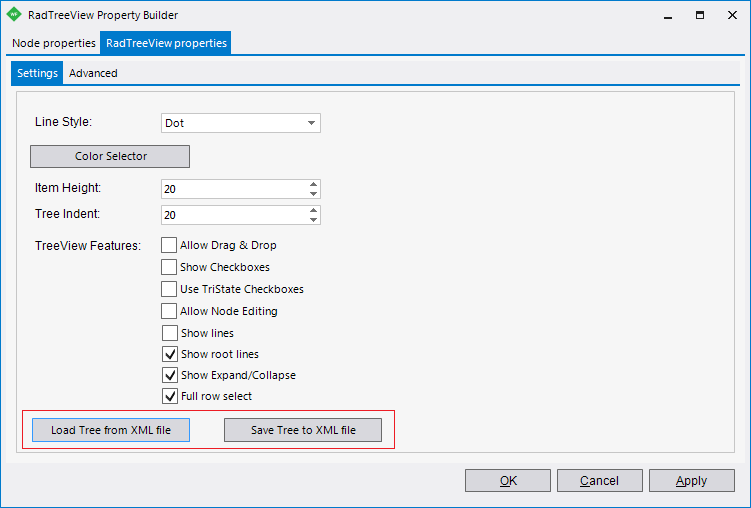
Line Style: Controls the style of the line that connects the nodes. The possible values are: Dot, Dash, Solid, DotDash, and DotDashDot. You can set the color of the line by using the ColorSelector button.
Item Height: Controls the height of all items.
Tree Indent: Controls the step between the parent and child nodes.
TreeView Features: Lets enable Drag & Drop, Checkboxes, TriState Checkboxes editing and others.
Save tree to XML allows you to save the already configured tree into an XML file.
Load tree from XML allows you to load tree nodes from an XML file.
Figure 5. The RadTreeViewProperties
The Advanced tab
Figure 6. The RadTreeViewProperties
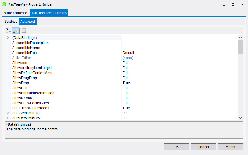
The Advanced tab displays all the properties of the RadTreeView as you would see them in the Properties window. The Advanced tab provides the best control over the RadTreeView characteristics but it may take longer to find the relevant properties.