Structure of RadRibbonBar
This article describes the inner structure and organization of the elements which build the RadRibbonBar control.
Element Hierarchy
RadRibbonBar is a complex control. In order to customize the styles that determine the display of this control, you need to know its structure. Here is a brief explanation of some of the elements in the tree.
This image shows the RadRibbonBar control element structure as displayed by the Element Hierarchy Editor:
Figure 1: RadRibbonBar`s Element Hierarchy
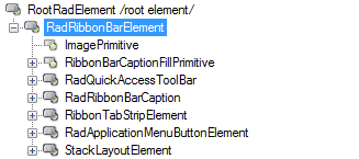
RadRibbonBarElement: Represents the entire RadRibbonBar. Any setting at this level are inherited by the elements down in the tree.
The RadQuickAccessToolbar: Represents the Quick Access Toolbar and any settings made to this element and its child nodes reflect on the visual appearance of the element.
RadRibbonBarCaption: Contains the minimize, maximize and close buttons.
RadItem: Contains the RadTabStripElement used in RadRibbonBar.
RadApplicationMenuButtonElement: The button element of the application drop-down menu.
The RadMDIControlsItem: Represents the system buttons displayed when a MDI child is maximized in a Form which contains a RadRibbonBar control.
The RibbonBarCaptionFillPrimitive: Represents the background fill of the RibbonBar's caption (title bar).
The RadImageButtonElement: Node represents the Help button which may be shown next to the MDI System Buttons
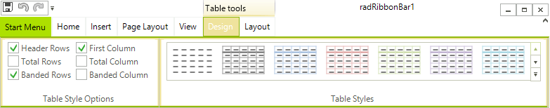
You can add a variety of constituent controls to customize the Telerik RadRibbonBar.
Quick Access Toolbar
The Quick Access Toolbar is an area at the top of the Telerik RadRibbonBar, above the tabs: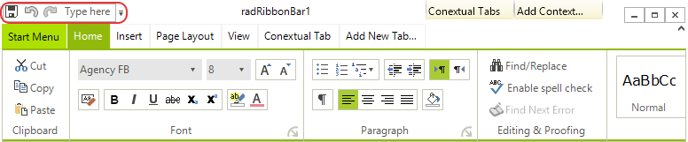
The Quick Access Toolbar can contain the same elements as the RadMenu:
Menu items, displayed as either images, text, or both
Combo boxes
Custom items
Separators
Start Menu
The Start Menu is a menu that is displayed when you click on the Office Button in the upper left corner of the Telerik RadRibbonBar: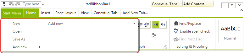
The Start Menu includes two columns of items, each of which can contain the same elements as the RadMenu:
Menu items, displayed as either images, text, or both
Combo boxes
Custom items
Separators
Tabs
The tabs are the first level of organization of the main part of the Telerik RadRibbonBar. Tabs are typically used to split the functionality of an application into major areas.
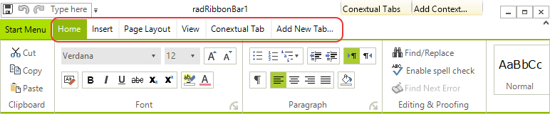
The drop-down arrow to the right of the tabs opens a menu listing all of the tabs on the Telerik RadRibbonBar. Selecting a tab from the menu makes it the active tab.
Contextual Tabs Groups
Contextual Tab Groups provide a way to organize related tabs. They are often used to group tabs that apply to a specific object in your application.
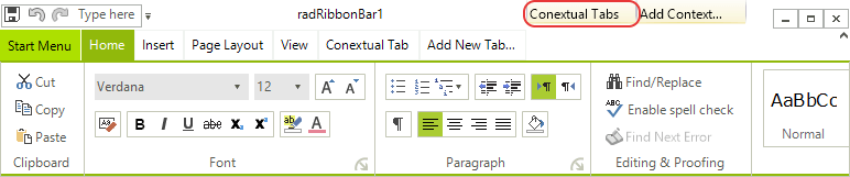
In the screenshot above, Appearance and Data are contextual tab groups. Their width indicates the tabs that they contain, so that the Appearance contextual tab group includes the Formatting and Layout tabs, and the Data contextual tab group includes the Spelling and Insert tabs. Color is also used to unify a contextual tab group with its contained Ribbon Bar Groups. The tabs that belong to contextual tab groups are always placed to the right of other tabs on the Telerik RadRibbonBar.
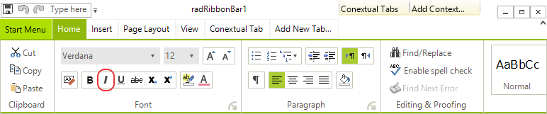
Ribbon Bar Groups
Each tab hosts one or more groups. A group is a container for the other containers and individual functional elements. Ribbon Bar Groups can individually collapse if there is not enough room to display all of them.
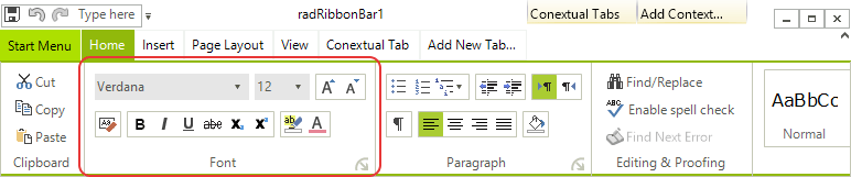
In the screenshot above, Clipboard, Font, and Paragraph are Ribbon Bar Groups placed on the Write tab.
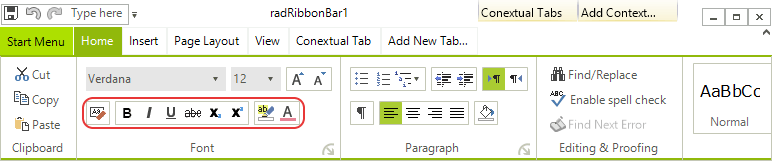
Button Groups
Ribbon Bar Groups may (but are not required to) contain one or more button groups. A button group is a container that can contain other nested button groups or individual functional elements. Button groups can be oriented horizontally (containing a horizontal row of elements) or vertically (containing a vertical column of elements).
Elements
Elements are the individual functional pieces of the Telerik RadRibbonBar. Elements can be contained directly within Ribbon Bar Groups or within button groups. Ribbon Bar Groups and button groups can contain a variety of elements:
Button elements, displayed as either images, text, or both
Drop-down button elements
Split button elements
Repeat button elements
Toggle button elements
Check box elements
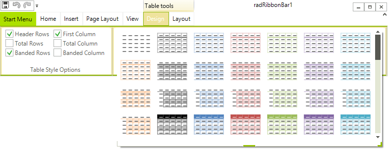
Galleries
A gallery is a special type of element that is designed to allow the user to select visually from among a number of choices. A gallery may be displayed in either collapsed or expanded view.
In its default collapsed view, a gallery shows a single row of choices, as well as up and down arrows for scrolling to other rows of choices and a drop-down arrow for switching to expanded view.
In its expanded view, a gallery shows all of its choices at one time, a filter selection bar at the top, and tools at the bottom.