Using Large and Small Images
Elements on a RadRibbonBar (such as buttons, check boxes, and repeat buttons) can each be assigned two images. In addition to the regular set of image properties (Image, ImageIndex, and ImageKey), there is a second set of image properties (SmallImage, SmallImageIndex, and SmallImageKey) that are used to designate an alternative, small, image for the element. This small image is only displayed when the user resizes the form on which the RadRibbonBar control is displayed and using small images enables the control to display more elements.
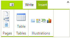
For example, here is a RadRibbonBar control with adequate space to display all of its default images.
Figure 1: RibbonBar with Enough Space

As the user resizes the form containing the control, the labels in the Text group are first eliminated to save space.
Figure 2: RibbonBar with Smaller Width

Usually, the small images are with size 16x16, while the bigger images are at least 32x32.
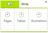
Continued resizing switches the elements in the Insert group from their large images to their small images (in addition to eliminating their labels):
Figure 3: Collapsed Groups
