Using Different Elements on a RadRibbonBar
You can build the user interface with a RadRibbonBar using a variety of different elements. In this tutorial, you will see how some of these elements can be placed and customized.
Prepare an ImageList to be Used in the Telerik RadRibbonBar
1. Create a RadRibbonForm control by adding it by clicking on the 'Add New Item...' option in the context menu of the project or by changing the base class of a standard Windows Form to RadRibbonForm.
2. Open the designer of the RadRibbonForm
3. Drag a WinForms ImageList component from the Toolbox to the form. In the area below the design surface, you will see imageList1.
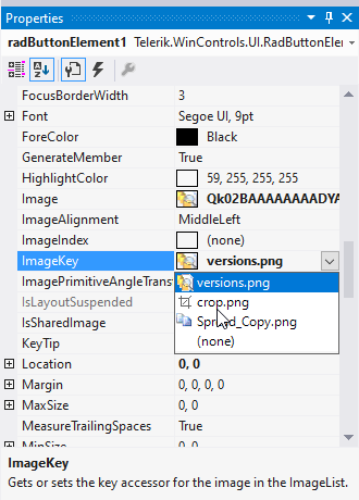
4. Using the Images Collection Editor, add the desired images to the ImageList. For more help with this task, see How to: Add or Remove ImageList Images with the Designer in Visual Studio documentation.
A predefined list of images has been prepared for the purpose of this example.
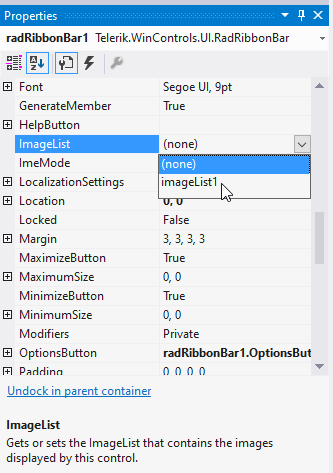
5. Apply the ImageList to RadRibbonBar:
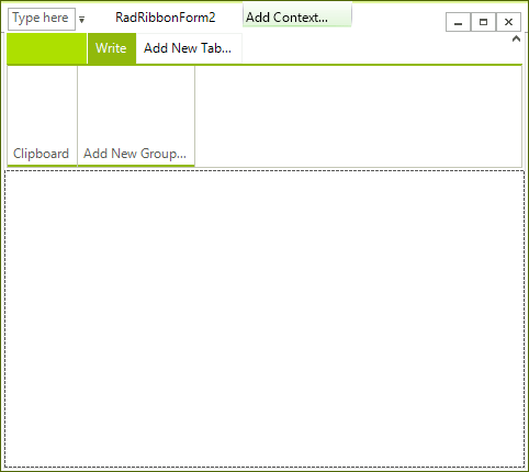
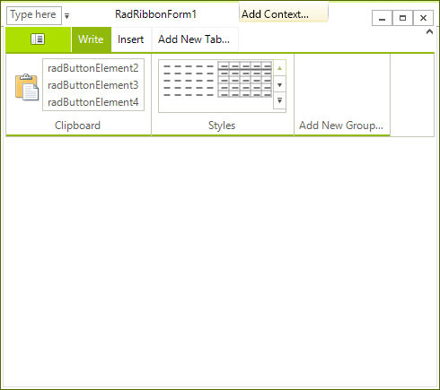
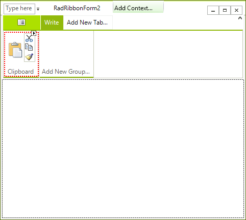
Adding a Tab and a Group
Click Add New Tab... to create a new tab.
Type the word Write and press Enter.
Click off the Write tab to deselect it.
Select the Write tab again.
Click Add New Group... to create a new group.
Set the Text property of the new group to Clipboard.
Add Elements
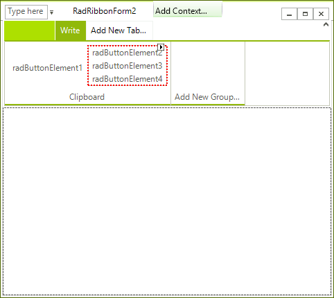
Right-click the Clipboard group and select Add an item, and then RadButtonElement.
Select the Clipboard group again and by right-clicking on it add a Vertical Button Group.
Select the group and open the Properties window. Find the ShowBorder property and set it to true.
Select the Vertical Button Group and from its SmartTag execute the Edit Items action.
Add three RadButtonElement instances in the button group:
Customize the RadButtonElement
Select the RadButtonElement which is outside the Button Group.
Set the TextImageRelation property to ImageAboveText.
-
Set an appropriate image by modifying the Image property or selecting ImageKey from the associated ImageList:
Set the ImageAlignment property to MiddleCenter.
Set the Text property to Paste and the TextAlignment property to MiddleCenter.
With an appropriate Image the RadRibbonBar should look similarly:
Customize the RadButtonElements in the RadRibbonBarButtonGroup
Select the first RadButtonElement in the RadRibbonBarButtonGroup.
Set the DisplayStyle property to Image
Set the ImageAlignment property to MiddleCenter
Set the Image property with an appropriate image
Do the same for the rest elements in the RadRibbonBarButtonGroup so that the result looks similar to this:
Adding a RadGalleryElement
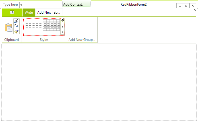
Select the RadRibbonBar control and add another RadRibbonBarGroup called Styles in the 'Write' tab.
Select the Styles group, right-click on it and add a RadGalleryElement.
Select the RadGalleryElement and open the Properties window of Visual Studio. Find the Items collection and add 6 RadGalleryItem instances.
Set appropriate images to all of the RadGalleryItem instances.
For each RadGalleryItem set the DisplayStyle property to Image so that no text appears.
Find the MaxColumns and MaxRows properties of the RadGalleryElement and set their values to 2 and 5 respectively. The result should be similar to this:
For the purpose of this demonstration Office 2007 like images for the gallery have been used.