Customizing RadRibbonBar
You can control several aspects of the overall RadRibbonBar presentation by setting the corresponding properties:
- The Expanded property controls whether the base of the control (the area beneath the tabs) will be visible initially. Set this property to False to hide the base of the control.
Figure 1: Expanded RibbonBar
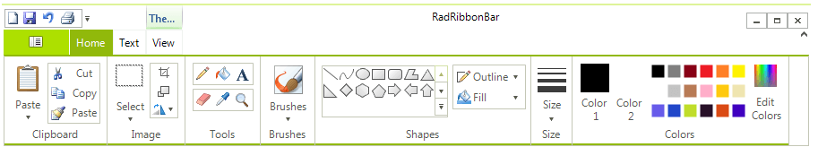
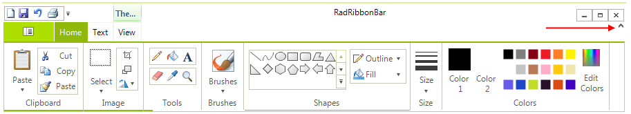
Figure 2: Collapsed RibbonBar

The Expanded property also indicates whether the Ribbon Bar is expanded or collapsed. For instance, the end-user can collapse the control by double-clicking on any of the tabs
- The ShowExpandButton property controls whether the expand/collapse button will shown in RadRibbonBar. Set this property to True to show the button.
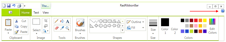
- The ShowHelpButton property controls whether the Help button will shown in RadRibbonBar. Set this property to True to show the button.
- The StartButtonImage property specifies an image to use for the Start Button in the upper left corner of the control.
-
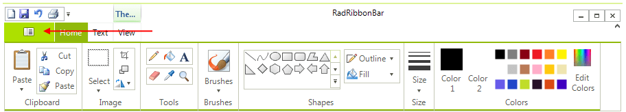
The size of the Start Button is determined by the size of the image set.
- The Text property determines the text which is displayed in the Ribbon Bar's caption.