Selection
The RadHeatMap control provides visual cell selection functionality with a default border around the selected cell. However, if you want to disable this feature, you can set the AllowSelection property of the RadHeatMap control to false.
Here is a list of properties related to the selection functionality:
- AllowSelection: Controls whether cell selection is enabled or disabled. Set it to false to disable selection.
- SelectedCellBorderColor: Specifies the color of the border displayed around the selected cell.
- SelectedCellBorderWidth: Sets the width of the border around the selected cell.
- SelectedDataItem: Gets the selected data item based on the selected cell index.
- SelectedCellIndex: Represents the index of the currently selected cell. You can access and modify this property to programmatically track or change the selected cell.
By modifying these properties, you can customize the selection behavior of the RadHeatMap control according to your specific requirements.
In addition to these properties, the RadHeatMap control also provides two events related to the selection functionality:
SelectedCellIndexChanging: This event is raised before the index of the selected cell changes. It provides an opportunity to handle the selection change event and potentially cancel the selection change if needed.
SelectedCellIndexChanged: This event is triggered when the index of the selected cell changes. It allows you to respond to changes for the current selected cell and perform any necessary actions or updates.
Example 1: Modify Selected Cell
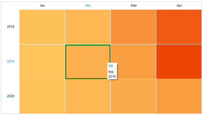
this.radHeatMap1.SelectedCellBorderColor = Color.Green;
this.radHeatMap1.SelectedCellBorderWidth = 3;
Me.RadHeatMap1.SelectedCellBorderColor = Color.Green
Me.RadHeatMap1.SelectedCellBorderWidth = 3
Figure 1: RadHeatMap with customize selection border
Set Selected Cell Programmatically
We can set the selected cell through the SelectedCellIndex property.
Example 2: Programmatic Selection
this.radHeatMap1.SelectedCellIndex = new CellIndex(2,2);
Me.RadHeatMap1.SelectedCellIndex = New CellIndex(2,2)
Hover State
When the mouse cursor hovers over a cell, it will be visually highlighted to notify the user. This visual feedback is designed to improve the user experience by indicating the active or focused cell and providing an intuitive response to the end user's interaction.
Here is a list of properties related to the mouse over effect:
- HeaderCellHoverBackColor: Gets or sets the header cell mouse over background color.|
- HeaderCellHoverForeColor: Gets or sets the header cell mouse over foreground color.|
- HoveredCellBorderColor: Gets or sets the hovered cell border color.|
- HoveredCellBorderWidth: Gets or sets the hovered cell border width.|
By modifying these properties, you can customize the hover state appearance in your RadHeatMap control, making it more visually appealing and interactive for users.
In addition, the RadHeatMap control also provides an event that will be raised when hovered cell index is changed:
- HoveredCellIndexChanged: Occurs when the hovered cell index has changed. For column header cells the CellIndex.RowIndex is -1. For row header cells the CellIndex.ColumnIndex is -1.