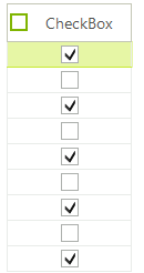
GridViewCheckBoxColumn
GridViewCheckBoxColumn displays and allows editing of boolean data. The values are shown as check boxes and allow the user to set or clear the check boxes to toggle the underlying boolean data values. GridViewCheckBoxColumn inherits from GridViewDataColumn.
Create and add GridViewCheckBoxColumn
GridViewCheckBoxColumn checkBoxColumn = new GridViewCheckBoxColumn();
checkBoxColumn.DataType = typeof(int);
checkBoxColumn.Name = "DiscontinuedColumn";
checkBoxColumn.FieldName = "Discontinued";
checkBoxColumn.HeaderText = "Discontinued?";
radGridView1.MasterTemplate.Columns.Add(checkBoxColumn);
Dim checkBoxColumn As New GridViewCheckBoxColumn()
checkBoxColumn.DataType = GetType(Integer)
checkBoxColumn.Name = "DiscontinuedColumn"
checkBoxColumn.FieldName = "Discontinued"
checkBoxColumn.HeaderText = "Discontinued?"
RadGridView1.MasterTemplate.Columns.Add(checkBoxColumn)
The column has also a built-in functionality for checking all check boxes in it, via check box placed in the column header cell. By setting the EnableHeaderCheckBox property to true you will enable the embedded in the header cell RadCheckBoxElement.
checkBoxColumn.EnableHeaderCheckBox = true;
checkBoxColumn.EnableHeaderCheckBox = True
ValueChanged event
ValueChanged event can be used in particular about check box state change. You have to check the active editor type as in the example below:
void radGridView1_ValueChanged(object sender, EventArgs e)
{
    if (this.radGridView1.ActiveEditor is RadCheckBoxEditor)
    {
        Console.WriteLine(this.radGridView1.CurrentCell.RowIndex);
        Console.WriteLine(this.radGridView1.ActiveEditor.Value);
    }
}
Private Sub RadGridView1_ValueChanged(ByVal sender As Object, ByVal e As System.EventArgs) Handles RadGridView1.ValueChanged
    If TypeOf Me.RadGridView1.ActiveEditor Is RadCheckBoxEditor Then
        Console.WriteLine(Me.RadGridView1.CurrentCell.RowIndex)
        Console.WriteLine(Me.RadGridView1.ActiveEditor.Value)
    End If
End Sub
HeaderCellToggleStateChanged event
To handle the toggle state change of the embedded check box in the header cell you should use the HeaderCellToggleStateChanged event of RadGridView.
void radGridView1_HeaderCellToggleStateChanged(object sender, GridViewHeaderCellEventArgs e)
{
    Console.WriteLine(e.Column.Name);
    Console.WriteLine(e.State);
}
Private Sub radGridView1_HeaderCellToggleStateChanged(sender As Object, e As GridViewHeaderCellEventArgs)
    Console.WriteLine(e.Column.Name)
    Console.WriteLine(e.State)
End Sub
EditMode
The EditMode property controls when the value of the editor will be submitted to the cell. By default, the current behavior is kept (OnValidate) and the value will be submitted only when the current cell changes or the grid looses focus. The new value (OnValueChange) will submit the value immediately after the editor value changes.
checkBoxColumn.EditMode = EditMode.OnValueChange;
checkBoxColumn.EditMode = EditMode.OnValueChange
GridViewCheckBoxColumn's Properties
| Property | Description |
|---|---|
| ThreeState | Gets or sets a value indicating whether to use a three state check-box. |
| DataType | Gets or sets a value indicating the column's data type. |
| EnableHeaderCheckBox | Gets or sets a value indicating whether to show embedded check-box in header cell. |
| Checked | Gets a value indicating whether the check-box in header cell checked. |
| ShouldCheckDataRows | This property determines whether the check-box in the header cell will be synced with the data cells. |
| EditMode | This property determines whether changing a value of a check box will immediately be send to the cell (OnValueChange) or when the current cell is changed or the grid is being validated (OnCellChangeOrValidating). |
| HeaderCheckBoxPosition | Controls the position of the checkbox and the text, possible values are Left, Right and Center. |
| HeaderCheckBoxAlignmentProperty | Controls the alignment of the checkbox to the Text. |
| CheckFilteredRows | Gets or sets a value indicating if the hidden rows will be checked by the header check-box. |
| HeaderCheckBoxPosition/HeaderCheckBoxAlignment | Result |
|---|---|
| HeaderCheckBoxPosition = HorizontalAlignment.Right & HeaderCheckBoxAlignment = ContentAlignment.MiddleLeft | 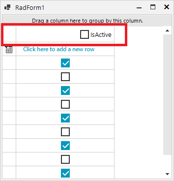 |
| HeaderCheckBoxPosition = HorizontalAlignment.Right & HeaderCheckBoxAlignment = ContentAlignment.MiddleRight | 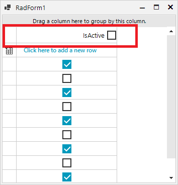 |