Visual Data Representation
This article requires that readers are familiar with the workings of the TPF property system.
RadCardView synchronizes the most important RadProperties between the different RadCardViewItems, meaning that a change in certain RadProperty of a particular CardViewItem affects the other items as well. The list below contains the properties which are synchronized by default.
- VisualElement.BackColorProperty
- LightVisualElement.BackColor2Property
- LightVisualElement.BackColor3Property
- LightVisualElement.BackColor4Property
- LightVisualElement.NumberOfColorsProperty
- LightVisualElement.DrawFillProperty
- VisualElement.ForeColorProperty
- VisualElement.FontProperty
- LightVisualElement.TextWrapProperty
- LightVisualElement.DrawTextProperty
- LightVisualElement.TextAlignmentProperty
- LightVisualElement.ImageAlignmentProperty
- LightVisualElement.TextImageRelationProperty
- LightVisualElement.BorderColorProperty
- LightVisualElement.DrawBorderProperty
- LightVisualElement.BorderWidthProperty
- LightVisualElement.GradientStyleProperty
- LightVisualElement.GradientPercentageProperty
- LightVisualElement.GradientPercentage2Property
The collection with these RadProperties is static and it it accessible, therefore changes of the collection are possible. The example below adds the LightVisualElement.VisibilityProperty and sets others in order to customize the appearance of the items.
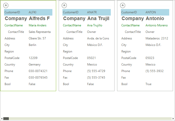
Figure 1: Modifying RadProperties
Formatting the Visual Item
public CardviewCustomizingAppearance()
{
    InitializeComponent();
    CardListViewElement.ItemSynchronizationProperties.Add(LightVisualElement.VisibilityProperty);
    this.CustomizeAppearance();
}
private void CustomizeAppearance()
{
    LayoutControlGroupItem group = this.radCardView1.CardTemplate.Items[0] as LayoutControlGroupItem;
    CardViewItem item = (CardViewItem)group.Items[3];
    item.TextAlignment = ContentAlignment.MiddleCenter;
    item = (CardViewItem)group.Items[2];
    item.ForeColor = Color.Green;
    item = (CardViewItem)group.Items[1];
    item.Font = new Font("Arial", 14, FontStyle.Bold);
    item = (CardViewItem)group.Items[0];
    item.DrawFill = true;
    item.BackColor = Color.LightBlue;
    item.GradientStyle = GradientStyles.Solid;
    item = (CardViewItem)group.Items.Last;
    item.Visibility = ElementVisibility.Hidden;
}
Public Sub New()
    InitializeComponent()
    CardListViewElement.ItemSynchronizationProperties.Add(LightVisualElement.VisibilityProperty)
    Me.CustomizeAppearance()
End Sub
Private Sub CustomizeAppearance()
    Dim group As LayoutControlGroupItem = TryCast(Me.RadCardView1.CardTemplate.Items(0), LayoutControlGroupItem)
    Dim item As CardViewItem = DirectCast(group.Items(3), CardViewItem)
    item.TextAlignment = ContentAlignment.MiddleCenter
    item = DirectCast(group.Items(2), CardViewItem)
    item.ForeColor = Color.Green
    item = DirectCast(group.Items(1), CardViewItem)
    item.Font = New Font("Arial", 14, FontStyle.Bold)
    item = DirectCast(group.Items(0), CardViewItem)
    item.DrawFill = True
    item.BackColor = Color.LightBlue
    item.GradientStyle = GradientStyles.Solid
    item = DirectCast(group.Items.Last, CardViewItem)
    item.Visibility = ElementVisibility.Hidden
End Sub