.NET MAUI TreeDataGrid Styling
The .NET MAUI TreeDataGrid control inherits all styling options provided by the DataGrid control. Also, you can modify the appearance of the expand and collapse indicator style.
The Styling is part of Telerik UI for .NET MAUI, the most comprehensive UI suite for .NET MAUI! To try it out, sign up for a free 30-day trial and kickstart your cross-platform app development today.
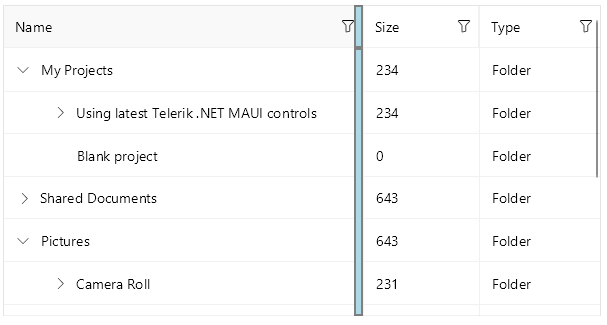
Style the Border Around the TreeDataGrid
You can configure the border around the TreeDataGrid control by using the following properties:
-
BorderBrush—Defines the brush of the border placed around the TreeDataGrid control. -
BorderThickness—Defines the thickness of the border around the TreeDataGrid control.
The following snippet shows how to set the BorderBrush and BorderThickness properties of the TreeDataGrid control:
<Style TargetType="telerik:RadTreeDataGrid">
    <Setter Property="BorderBrush" Value="#8660C5" />
    <Setter Property="BorderThickness" Value="2" />
</Style>
The next image shows the end result.
Style the TreeDataGrid Cells and Rows
You can style the rows and cells of the TreeDataGrid with the following properties:
-
RowBackgroundStyle(Stylewith target typeDataGridRowBackgroundAppearance)—Defines the style of each row. -
AlternateRowBackgroundStyle(Stylewith target typeDataGridRowBackgroundAppearance)—Defines the appearance style of an alternated row. -
SelectionStyle(Stylewith target typeDataGridSelectionAppearance)—Defines the appearance settings applied to the selected DataGrid row. -
CurrentCellStyle(Stylewith target typeDataGridCurrentCellAppearance)—Defines the style applied to the current cell. - (Desktop-only)
MouseHoverStyle(Stylewith target typeDataGridMouseHoverAppearance)—Specifies the style applied to the cells and rows when the mouse is over them.
The target types of the RowBackgroundStyle, AlternateRowBackgroundStyle, SelectionStyle, CurrentCellStyle, and MouseHoverStyle styling properties derive from the DataGridBorderAppearance class. The DataGridBorderAppearance exposes the following properties:
-
SearchMatchBackgroundColor(Color)—Specifies the color that fills the area within the border when the cell contains a search-match. -
BackgroundColor(Color)—Specifies the color that fills the area within the border. -
BorderColor(Color)—Specifies the border color. -
BorderThickness(Thickness)—Specifies the thickness of the border.
For more information on styling the CurrentCell by using the CurrentCellStyle property, review the Cells article.
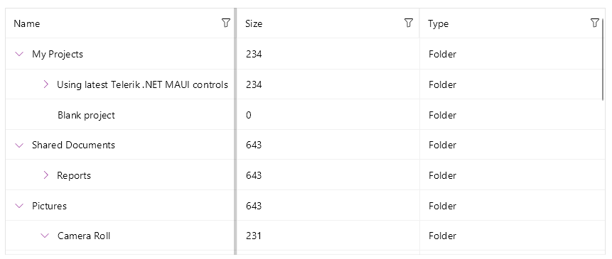
Style the Expand/Collapse Indicator
You can style the expand/collapse indicator by using the ExpandCollapseIndicatorStyle (Style with target type TreeDataGridExpandCollapseIndicatorAppearance) property. The TreeDataGridExpandCollapseIndicatorAppearance class exposes the following properties:
-
ExpandText—Specifies the text for the expand indicator of the item. -
CollapseText—Specifies the text for the collapse indicator of the item. -
TextColor—Specifies the color of the expand/collapse symbol. -
Font Options—Specifies theFontSize,FontAttributes, andFontFamily. -
Margin—Specifies the margin for the expand/collapse symbol of the item. -
BackgroundColor(Color)—Specifies the color that fills the area within the border. -
BorderColor(Color)—Specifies the border color. -
BorderThickness(Thickness)—Specifies the thickness of the border.
You can set the ExpandCollapseIndicatorStyle property in the following way:
<telerik:RadTreeDataGrid>
    <telerik:RadTreeDataGrid.ExpandCollapseIndicatorStyle>
        <Style TargetType="telerik:TreeDataGridExpandCollapseIndicatorAppearance">
            <Setter Property="TextColor" Value="Purple" />
        </Style>
    </telerik:RadTreeDataGrid.ExpandCollapseIndicatorStyle>
</telerik:RadTreeDataGrid>
The next image shows the end result.
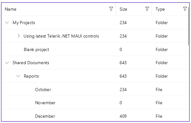
Configure and Style the Horizontal and Vertical Grid Lines
Use the following properties for configuring the TreeDataGrid grid lines:
-
GridLinesVisibility(Telerik.Maui.Controls.DataGrid.GridLinesVisibility)—Defines which DataGrid lines are currently visible (displayed). The property accepts theBoth,Horizontal,None, andVerticalvalues. -
GridLinesColor—Defines the appearance of the horizontal and vertical DataGrid lines. -
GridLinesThickness—Defines the width of the vertical and the height of the horizontal DataGrid lines.
You can set the GridLinesVisibility property in the following way:
<telerik:RadTreeDataGrid ItemsSource="{Binding Items}"
                         GridLinesVisibility="Both"
                         GridLinesColor="#8660C5"
                         GridLinesThickness="2"
                         AutoGenerateColumns="False">
    <telerik:RadTreeDataGrid.ItemDescriptor>
        <telerik:TreeDataGridItemDescriptor ItemsSourceBinding="{Binding Children}" />
    </telerik:RadTreeDataGrid.ItemDescriptor>
    <telerik:RadTreeDataGrid.Columns>
        <telerik:DataGridTextColumn PropertyName="Name" />
        <telerik:DataGridNumericalColumn PropertyName="Size" />
        <telerik:DataGridTextColumn PropertyName="Type" />
    </telerik:RadTreeDataGrid.Columns>
</telerik:RadTreeDataGrid>
The next image shows the end result.
Style the Splitter UI
The TreeDataGrid provides the FrozenColumnsSplitterStyle (of type Style with target type DataGridFrozenColumnsSplitterAppearance) property which allows you to style the UI of the splitter dividing the frozen (locked) from the unfrozen (unlocked) columns.
To style the appearance of the splitter, which appears when the user freezes (locks) the columns in the TreeDataGrid, use the Width, BackgroundColor, BorderColor, and BorderThickness properties.
<telerik:RadTreeDataGrid>
    <telerik:RadTreeDataGrid.FrozenColumnsSplitterStyle>
        <Style TargetType="telerik:DataGridFrozenColumnsSplitterAppearance">
            <Setter Property="Width" Value="5" />
            <Setter Property="BorderColor" Value="Gray" />
            <Setter Property="BorderThickness" Value="2" />
            <Setter Property="BackgroundColor" Value="LightBlue" />
        </Style>
    </telerik:RadTreeDataGrid.FrozenColumnsSplitterStyle>
</telerik:RadTreeDataGrid>
The next image shows the end result.