.NET MAUI TemplatedPicker DropDown Styling
By using the DropDownSettings property (of type Telerik.Maui.Controls.PickerDropDownSettings) of the TemplatedPicker, you can modify the appearance of the dropdown. The PickerDropDownSettings class exposes the following Style properties:
-
DropDownViewStyle(of typeStylewith target typetelerikInput:PickerDropDownContentView)—Defines the dropdown view style. -
FooterStyle(of typeStylewith target typetelerikInput:PickerPopupFooterView)—Defines the dropdown footer style. -
AcceptButtonStyle(of typeStylewith target typeButton)—Defines the Accept button style. -
CancelButtonStyle(of typeStylewith target typeButton)—Defines the Cancel button style.
The DropDownSettings also provides the following properties for dropdown customization:
-
Placement(of typePlacementMode)—Specifies the position of the dropdown, can be set to Bottom, Right, Left, Top, Center or Relative. -
HorizontalOffset\VerticalOffset—Specifies the horizontal\vertical distance between the dropdown and the TemplatedPicker. -
IsFooterVisible(bool)—Specifies whether the DropDown footer is currently visible. By default, the value isTrue. -
AcceptButtonText(string)—Defines the text visualized for the Accept button. By default, the text isOK. -
CancelButtonText(string)—Defines the text visualized for the Cancel button. By default, the text isCancel.
Example
The following example shows how the styling properties are applied.
Define the RadTemplatedPicker
<telerik:RadTemplatedPicker x:Name="picker"
                            PickerMode="DropDown"
                            Placeholder="Pick a destination!"
                            DisplayStringFormat="Destination: {0}"
                            SelectedValue="{Binding FromCity, Mode=TwoWay}"
                            DisplayMemberPath="Name"
                            AutomationId="templatedPicker">
    <telerik:RadTemplatedPicker.DropDownSettings>
        <telerik:PickerDropDownSettings DropDownViewStyle="{StaticResource dropDownViewStyle}"
                                        AcceptButtonStyle="{StaticResource pickerAcceptButtonStyle}"
                                        CancelButtonStyle="{StaticResource pickerCancelButtonStyle}"
                                        AcceptButtonText="{StaticResource acceptButtonText}"
                                        CancelButtonText="{StaticResource cancelButtonText}" />
    </telerik:RadTemplatedPicker.DropDownSettings>
    <telerik:RadTemplatedPicker.SelectorTemplate>
        <ControlTemplate>
            <Grid ColumnDefinitions="*,*" HeightRequest="250">
                <Grid.Style>
                    <OnPlatform x:TypeArguments="Style">
                        <On Platform="WinUI">
                            <Style TargetType="Grid">
                                <Setter Property="WidthRequest" Value="{Binding Width, Source={x:Reference picker}}" />
                            </Style>
                        </On>
                    </OnPlatform>
                </Grid.Style>
                <telerik:RadBorder Grid.ColumnSpan="2"
                                   Style="{StaticResource defaultRadBorderStyle}" />
                <telerik:RadSpinner x:Name="countriesSpinner"
                                    Grid.Column="0"
                                    ItemsSource="{Binding Countries}"
                                    DisplayMemberPath="Name" />
                <telerik:RadSpinner x:Name="citiesSpinner"
                                    Grid.Column="1"
                                    ItemsSource="{Binding SelectedItem.Cities, Source={x:Reference countriesSpinner}}"
                                    SelectedItem="{TemplateBinding SelectedValue}"
                                    DisplayMemberPath="Name" />
            </Grid>
        </ControlTemplate>
    </telerik:RadTemplatedPicker.SelectorTemplate>
</telerik:RadTemplatedPicker>
Define the DropDownViewStyle
<Style x:Key="dropDownViewStyle" TargetType="telerik:PickerDropDownContentView">
    <Setter Property="BackgroundColor" Value="#E4FCFF"/>
</Style>
Define the CommonButtonStyle
<Style x:Key="pickerFooterButtonStyle" TargetType="Button">
    <Setter Property="BackgroundColor" Value="Transparent"/>
    <Setter Property="TextColor" Value="{StaticResource AccentColor}"/>
    <Setter Property="VerticalOptions" Value="Center"/>
    <Setter Property="Margin">
        <OnPlatform x:TypeArguments="Thickness">
            <On Platform="iOS, MacCatalyst">0, 0, 20, 0</On>
        </OnPlatform>
    </Setter>
</Style>
Define the AcceptButtonStyle
<Style x:Key="pickerAcceptButtonStyle" BasedOn="{StaticResource pickerFooterButtonStyle}"
       TargetType="Button">
    <Setter Property="HorizontalOptions" Value="End"/>
</Style>
Define the CancelButtonStyle
<Style x:Key="pickerCancelButtonStyle" BasedOn="{StaticResource pickerFooterButtonStyle}"
       TargetType="Button">
    <Setter Property="HorizontalOptions" Value="EndAndExpand"/>
</Style>
Namespaces
In addition, add the following namespace:
xmlns:telerik="http://schemas.telerik.com/2022/xaml/maui"
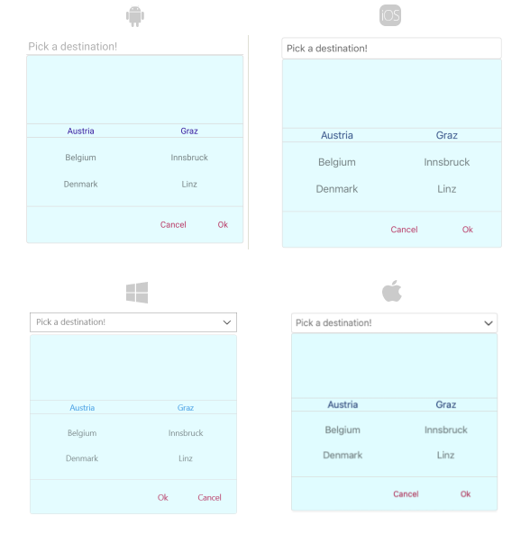
The following image shows how the TemplatedPicker control looks when the styles described above are applied.