.NET MAUI Scheduler More Appointments Indicator Styling
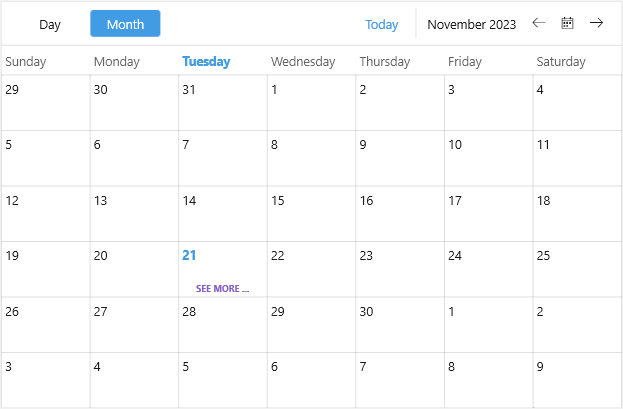
The Scheduler Month View displays appointments for one month and allows users to browse through longer-term periods. The space for appointments on a particular day is limited, and if there are more appointments on that day, a more appointments indicator appears to notify the users that not all appointments are shown.
You can customize the more appointments indicator through the DayMoreAppointmentsIndicatorStyle property of the MonthViewDefinition.
The following example demonstrates how to apply a sample style to theDayMoreAppointmentsIndicatorStyle:
1. Add a custom Style with TargetType set to Label to the page's resources:
<Style x:Key="DayMoreAppointmentsIndicatorStyle" TargetType="Label">
    <Setter Property="FontFamily" Value="Segoe UI" />
    <Setter Property="FontAttributes" Value="Bold" />
    <Setter Property="FontSize" Value="{OnPlatform Default=10, iOS=9, MacCatalyst=12}" />
    <Setter Property="TextColor" Value="#8660C5" />
    <Setter Property="TextTransform" Value="Uppercase" />
    <Setter Property="Text" Value="{OnIdiom Default='See more ...', Phone='More ...'}" />
    <Setter Property="HorizontalTextAlignment" Value="Center" />
</Style>
2. Define the Scheduler with a MonthViewDefinition with the DayMoreAppointmentsIndicatorStyle applied:
<telerik:RadScheduler x:Name="scheduler" ActiveViewDefinitionIndex="1">
    <telerik:RadScheduler.ViewDefinitions>
        <telerik:DayViewDefinition x:Name="dayViewDefinition" />
        <telerik:MonthViewDefinition DayMoreAppointmentsIndicatorStyle="{StaticResource DayMoreAppointmentsIndicatorStyle}" />
    </telerik:RadScheduler.ViewDefinitions>
</telerik:RadScheduler>