.NET MAUI Scheduler Header Styling
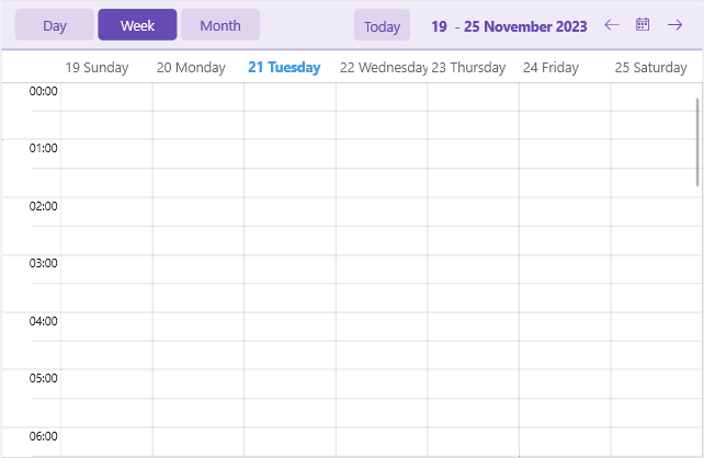
The .NET MAUI Scheduler component comes with built-in styling options that allow you to customize the appearance of its header.
You can style separately the header border, header labels, navigation buttons and more. Here is a list of the available header style properties of the Scheduler:
-
HeaderBorderStyle—Applies styles such as border thickness and color to the header. -
HeaderLabelStyle—Applies styles such as TextColor, FontSize, etc to the label displaying the visible range in the header. -
IncreaseVisibleRangeButtonStyleandDecreaseVisibleRangeButtonStyle—Apply styles to the buttons used for navigating the view (only desktop). -
TodayButtonStyle—Defines style for the Today button. -
HeaderIndicatorLabelStyle—Sets style to the label used for showing the popup for date selection (mobile only). -
ViewDefinitionHeaderItemStyleandActiveViewDefinitionHeaderItemStyle—Apply styles to the available views and active view headers.
The following example demonstrates how to apply custom header styles to the Scheduler:
1. Define the Scheduler:
<telerik:RadScheduler x:Name="scheduler"
                      HeaderBorderStyle="{StaticResource HeaderBorderStyle}"
                      HeaderLabelStyle="{StaticResource HeaderLabelStyle}"
                      IncreaseVisibleRangeButtonStyle="{StaticResource IncreaseVisibleRangeButtonStyle}"
                      DecreaseVisibleRangeButtonStyle="{StaticResource DecreaseVisibleRangeButtonStyle}"
                      TodayButtonStyle="{StaticResource TodayButtonStyle}"
                      HeaderIndicatorLabelStyle="{StaticResource HeaderIndicatorLabelStyle}"
                      ViewDefinitionHeaderItemStyle="{StaticResource ViewDefinitionHeaderItemStyle}"
                      ActiveViewDefinitionHeaderItemStyle="{StaticResource ActiveViewDefinitionHeaderItemStyle}"
                      ActiveViewDefinitionIndex="1">
    <telerik:RadScheduler.ViewDefinitions>
        <telerik:DayViewDefinition />
        <telerik:WeekViewDefinition />
        <telerik:MonthViewDefinition />
    </telerik:RadScheduler.ViewDefinitions>
</telerik:RadScheduler>
2. Add the custom styles to the page's resources:
<Style TargetType="telerik:RadBorder" x:Key="HeaderBorderStyle">
    <Setter Property="BackgroundColor" Value="#EEEAF6" />
    <Setter Property="BorderBrush" Value="#C3B4DF" />
    <Setter Property="BorderThickness" Value="0, 0, 0, 2" />
</Style>
<Style TargetType="Label" x:Key="HeaderLabelStyle">
    <Setter Property="TextColor" Value="#674BB2" />
    <Setter Property="FontAttributes" Value="Bold" />
</Style>
<Style TargetType="Button" x:Key="IncreaseVisibleRangeButtonStyle">
    <Setter Property="Text" Value="{x:Static telerik:TelerikFont.IconForward}" />
    <Setter Property="TextColor" Value="#674BB2" />
</Style>
<Style TargetType="Button" x:Key="DecreaseVisibleRangeButtonStyle">
    <Setter Property="Text" Value="{x:Static telerik:TelerikFont.IconBack}" />
    <Setter Property="TextColor" Value="#674BB2" />
</Style>
<Style TargetType="Button" x:Key="TodayButtonStyle">
    <Setter Property="TextColor" Value="#674BB2" />
    <Setter Property="BackgroundColor" Value="{OnPlatform Default=#66C3B4DF, Android=Transparent, iOS=Transparent}" />
    <Setter Property="BorderWidth" Value="0" />
</Style>
<Style TargetType="Label" x:Key="HeaderIndicatorLabelStyle">
    <Setter Property="TextColor" Value="#674BB2" />
    <Setter Property="BackgroundColor" Value="#66C3B4DF" />
    <Setter Property="Clip">
        <EllipseGeometry RadiusX="12"
                         RadiusY="12"
                         Center="{OnPlatform Default='20, 20', iOS='22, 22'}" />
    </Setter>
</Style>
<Style TargetType="telerik:SchedulerDatePicker">
    <Setter Property="ButtonStyle">
        <Setter.Value>
            <Style TargetType="Button">
                <Setter Property="TextColor" Value="#674BB2" />
            </Style>
        </Setter.Value>
    </Setter>
</Style>
<Style TargetType="telerik:SchedulerDropDownButton">
    <Setter Property="ButtonStyle">
        <Setter.Value>
            <Style TargetType="Button">
                <Setter Property="TextColor" Value="#674BB2" />
                <Setter Property="FontAttributes" Value="Bold" />
            </Style>
        </Setter.Value>
    </Setter>
</Style>
<Style TargetType="telerik:NonVirtualizedItemsControlItemContainer" x:Key="ViewDefinitionHeaderItemStyle">
    <Setter Property="TextColor" Value="#674BB2" />
    <Setter Property="BackgroundColor" Value="{OnPlatform Default=#66C3B4DF, Android=Transparent, iOS=Transparent}" />
    <Setter Property="BorderThickness" Value="0" />
    <Setter Property="VisualStateManager.VisualStateGroups">
        <VisualStateGroupList>
            <VisualStateGroup Name="CommonStates">
                <VisualState Name="Normal" />
                <VisualState Name="Focused" />
                <VisualState Name="PointerOver" />
                <VisualState Name="Disabled">
                    <VisualState.Setters>
                        <Setter Property="telerik:NonVirtualizedItemsControlItemContainer.BackgroundColor" Value="Transparent" />
                        <Setter Property="telerik:NonVirtualizedItemsControlItemContainer.TextColor" Value="#61674BB2" />
                    </VisualState.Setters>
                </VisualState>
            </VisualStateGroup>
        </VisualStateGroupList>
    </Setter>
</Style>
<Style TargetType="telerik:NonVirtualizedItemsControlItemContainer" x:Key="ActiveViewDefinitionHeaderItemStyle">
    <Setter Property="TextColor" Value="{OnPlatform Default=White, Android=#674BB2}" />
    <Setter Property="BackgroundColor" Value="{OnPlatform Default=#674BB2, Android=#F8F8F8}" />
    <Setter Property="BorderThickness" Value="0" />
    <Setter Property="VisualStateManager.VisualStateGroups">
        <VisualStateGroupList>
            <VisualStateGroup Name="CommonStates">
                <VisualState Name="Normal" />
                <VisualState Name="Focused" />
                <VisualState Name="PointerOver">
                    <VisualState.Setters>
                        <Setter Property="telerik:NonVirtualizedItemsControlItemContainer.BackgroundColor" Value="#765CBA" />
                    </VisualState.Setters>
                </VisualState>
                <VisualState Name="Disabled">
                    <VisualState.Setters>
                        <Setter Property="telerik:NonVirtualizedItemsControlItemContainer.TextColor" Value="{OnPlatform Default=#61FFFFFF, Android=#61674BB2}" />
                    </VisualState.Setters>
                </VisualState>
            </VisualStateGroup>
        </VisualStateGroupList>
    </Setter>
</Style>