.NET MAUI Entry Text Appearance
The Entry provides a number of settings for configuring the appearance of the text it displays such as the text input itself, adding a watermark to the text, setting the Entry in its read-only state, and so on.
Setting the Text Input
The following properties are related to the appearance and alignment of the text in the Entry control.
-
Text(string)—Defines the text. -
TextColor(Microsoft.Maui.Graphics)—Defines the color of the visible Entry text. -
TextTransform(Microsoft.Maui.TextTransform)—Defines the transformation of the text. -
VerticalTextAlignment(Microsoft.Maui.TextAlignment)—Specifies the vertical alignment of the text. -
HorizontalTextAlignment(Microsoft.Maui.TextAlignment)—Specifies the horizontal alignment of the text.
Adding Placeholder
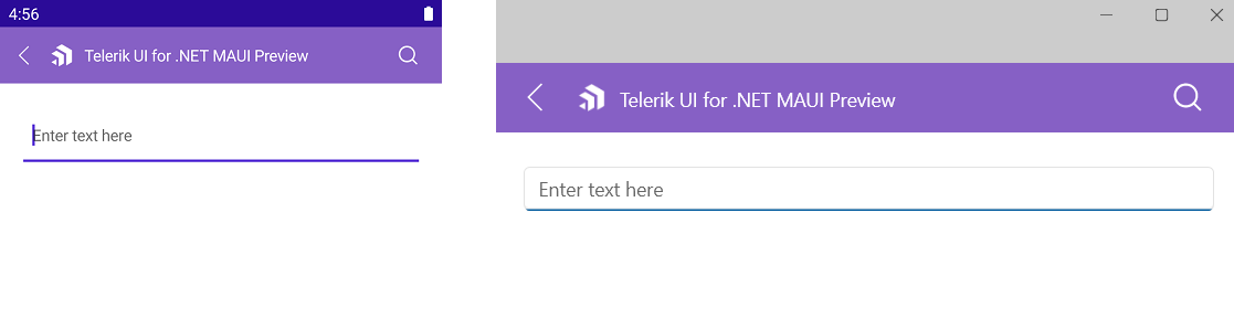
The Entry exposes the Placeholder (string) property that prompts users what information they are expected to enter in the text input. The placeholder text is displayed when the control is empty. Additionally, you can set the PlaceholderColor(Color) to customize the look of the watermark text as demonstrated in the following example.
<telerikInput:RadEntry Placeholder="Enter text here"
                       PlaceholderColor="#6EA3FF" />
In the provided example:
xmlns:telerik="http://schemas.telerik.com/2022/xaml/maui"
The following image shows the end result.
Password Functionality
The Telerik .NET MAUI Entry provides the IsPassword (bool) property. When set to True, it replaces the input with a password hint character. The default value is False.
<telerik:RadEntry Placeholder="Enter password"
                  IsPassword="True">
</telerik:RadEntry>
Setting the Read-Only State
You can choose whether the Entry control is editable for end users by setting its read-only state through the IsReadOnly (bool) property. By default, IsReadOnly is set to False. To restrict the control from editing, set the IsReadOnly to True.
<telerik:RadEntry x:Name="telerikEntry"
                  Text="Telerik UI for .NET MAUI Entry control"
                  IsReadOnly="True" />
Defining the Max Length
You can restrict the number of the symbols the Entry control allows for its input field by using the MaxLength (int) property.
The following example demonstrates how to set the maximum length of the input to 10 symbols.
<telerik:RadEntry x:Name="telerikEntry"
                  Placeholder="Enter text"
                  MaxLength="10" />
Setting Spacing Between the Characters
The CharacterSpacing (double) property allows you to define the space between the characters inside the control.
Setting Text Prediction
-
IsTextPredictionEnabled(bool) property allows you to define whether text prediction and automatic text correction are on or off. The default value isFalse.
<telerik:RadEntry x:Name="entry"
                  IsTextPredictionEnabled="True"
                  Placeholder="Enter Text" />
Setting the Keyboard Type
The Keyboard property of type Microsoft.Maui.Keyboard allows you to define the type of the keyboard that will be visualized by the device.
<telerik:RadEntry x:Name="entry"
                  Keyboard="Numeric"
                  Placeholder="Enter Number" />
Setting the Return Type
You can change the keyboard return key type using the ReturnType(Microsoft.Maui.ReturnType) property. The available options are Default,Done,Go,Next,Search and Send. The default return type is Default.
<telerik:RadEntry Placeholder="Enter your idea"
                  ReturnType="Send">
</telerik:RadEntry>
Defining the Clear Button visibility
The ClearButtonVisibility (Microsoft.Maui.ClearButtonVisibility) indicates when the clear button (the button that clears the text when pressed) can be displayed. The default value is WhileEditing.
If you want to hide the clear button while entering text inside the control, then set the ClearButtonVisibility to Never.