Styling the .NET MAUI DatePicker Popup
To modify the appearance of the DatePicker dialog (popup) element, use the PopupSettings property (of type Telerik.Maui.Controls.PickerPopupSettings) of the component.
Supported Properties
The PickerPopupSettings class exposes the following Style properties:
-
PopupViewStyle(of typeStylewith target typetelerik:PickerPopupContentView)—Defines the popup view style. -
HeaderStyle(of typeStylewith target typetelerik:PickerPopupHeaderView)—Defines the popup header style. -
HeaderLabelStyle(of typeStylewith target typeLabel)—Defines the popup header label style. -
FooterStyle(of typeStylewith target typetelerik:PickerPopupFooterView)—Defines the popup footer style. -
AcceptButtonStyle(of typeStylewith target typeButton)—Defines the Accept button style. -
CancelButtonStyle(of typeStylewith target typeButton)—Defines the Cancel button style.
The PickerPopupSettings also provides the following properties for popup customization:
-
PopupOutsideBackgroundColor—Defines the color outside of the popup. -
IsPopupModal(bool)—Defines a Boolean value indicating if the popup will be closed when tapped outside of the popup. By default, the value of theIsPopupModalisfalse.When
IsPopupModal="True", the UI behind the popup gets inactive and cannot be used until the popup is closed.When
IsPopupModal="False", the popup can be closed when clicking outside the popup. HeaderLabelText(string)—Specifies the text visualized in the popup header.-
IsHeaderVisible(bool)—Specifies whether the Popup header is currently visible. By default, the value isTrue -
IsFooterVisible(bool)—Specifies whether the Popup footer is currently visible. By default, the value isTrue. -
AcceptButtonText(string)—Defines the text visualized for the Accept button. By default, the text isOK. -
CancelButtonText(string)—Defines the text visualized for the Cancel button. By default, the text isCancel.
PopupSettingsprovides styling options for the popup, its header, footer, outside background color, and other. To customize the look and feel of the spinner controls which show the available date values, use theSpinnerStyle,SpinnerHeaderStyle, andSelectionHighlightStyleproperties of the DatePicker.
Setting the Properties
The following examples demonstrate how to define and use the styling properties of the DatePicker popup. Note that in addition to each snippet, you must add the telerik namespaces:
xmlns:telerik="http://schemas.telerik.com/2022/xaml/maui"
Define the style of the DatePicker
<telerik:RadDatePicker PickerMode="Popup"
                       SpinnerFormat="yyy/MMM/dd"
                       DisplayStringFormat="yyyy/MMM/dd"
                       AutomationId="datePicker">
    <telerik:RadDatePicker.PopupSettings>
        <telerik:PickerPopupSettings PopupOutsideBackgroundColor="#D9D9D9CC"
                                     PopupViewStyle="{StaticResource popupViewStyle}"
                                     HeaderStyle="{StaticResource headerStyle}"
                                     HeaderLabelText="Date Picker"
                                     HeaderLabelStyle="{StaticResource headerLabelStyle}"
                                     FooterStyle="{StaticResource footerStyle}"
                                     AcceptButtonStyle="{StaticResource acceptButtonStyle}"
                                     CancelButtonStyle="{StaticResource cancelButtonStyle}"
                                     AcceptButtonText="{StaticResource acceptButtonText}"
                                     CancelButtonText="{StaticResource cancelButtonText}"/>
    </telerik:RadDatePicker.PopupSettings>
</telerik:RadDatePicker>
Define the style of the popup view
<Style TargetType="telerik:PickerPopupContentView" x:Key="popupViewStyle">
    <Setter Property="BackgroundColor" Value="White"/>
    <Setter Property="WidthRequest" Value="270"/>
</Style>
Define the header style
<Style TargetType="telerik:PickerPopupHeaderView" x:Key="headerStyle">
    <Setter Property="BackgroundColor" Value="#00B5DC"/>
    <Setter Property="HeightRequest" Value="60"/>
    <Setter Property="Margin" Value="0"/>
    <Setter Property="Padding" Value="0"/>
    <Setter Property="HorizontalOptions" Value="FillAndExpand"/>
    <Setter Property="VerticalOptions" Value="FillAndExpand"/>
</Style>
Define the style of the header label
<Style TargetType="Label" x:Key="headerLabelStyle">
    <Setter Property="TextColor" Value="White"/>
    <Setter Property="HorizontalOptions" Value="Center"/>
    <Setter Property="VerticalOptions" Value="Center"/>
    <Setter Property="FontSize" Value="Title"/>
</Style>
Define the style of the footer
<Style TargetType="telerik:PickerPopupFooterView" x:Key="footerStyle">
    <Setter Property="BackgroundColor" Value="Transparent"/>
</Style>
Define the style of the Accept button
<Style TargetType="Button" x:Key="acceptButtonStyle">
    <Setter Property="BackgroundColor" Value="Transparent"/>
    <Setter Property="TextColor" Value="#00B5DC"/>
</Style>
Define the style of the Cancel button
<Style TargetType="Button" x:Key="cancelButtonStyle">
    <Setter Property="BackgroundColor" Value="Transparent"/>
    <Setter Property="TextColor" Value="#00B5DC"/>
</Style>
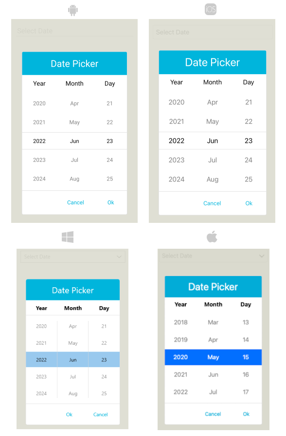
The following image shows a DatePicker control on different platforms after the styles have been applied to its popup: