Styling the .NET MAUI DatePicker Drop-Down
To modify the appearance of the DatePicker drop-down element, use the DropDownSettings property (of type Telerik.Maui.Controls.PickerDropDownSettings) of the component.
Supported Properties
The PickerDropDownSettings class exposes the following Style properties:
-
DropDownViewStyle(of typeStylewith target typetelerik:PickerDropDownContentView)—Defines the drop-down view style. -
FooterStyle(of typeStylewith target typetelerik:PickerPopupFooterView)—Defines the drop-down footer style. -
AcceptButtonStyle(of typeStylewith target typeButton)—Defines the Accept button style. -
CancelButtonStyle(of typeStylewith target typeButton)—Defines the Cancel button style.
The DropDownSettings also provides the following properties for drop-down customization:
-
Placement(of typePlacementMode)—Specifies the position of the drop-down. Can be set toBottom,Right,Left,Top,Center, orRelative. -
HorizontalOffsetorVerticalOffset—Specifies the horizontal or vertical distance between the drop-down and the DatePicker. -
IsFooterVisible(bool)—Specifies whether the footer of the drop-down is currently visible. By default, the value isTrue. -
AcceptButtonText(string)—Defines the text visualized for the Accept button. By default, the text isOK. -
CancelButtonText(string)—Defines the text visualized for the Cancel button. By default, the text isCancel.
DropDownSettingsprovides styling options for the drop-down, its footer, position, and other. To customize the look and feel of the spinner controls which show the available date values, use theSpinnerStyle,SpinnerHeaderStyle, andSelectionHighlightStyleproperties of the DatePicker.
Setting the Properties
The following examples demonstrate how to define and use the styling properties of the DatePicker popup. Note that in addition to each snippet, you must add the telerik namespaces:
xmlns:telerik="http://schemas.telerik.com/2022/xaml/maui"
Define the style of the DatePicker
<telerik:RadDatePicker PickerMode="DropDown"
                       SpinnerFormat="yyy/MMM/dd"
                       DisplayStringFormat="yyyy/MMM/dd"
                       AutomationId="datePicker">
    <telerik:RadDatePicker.DropDownSettings>
        <telerik:PickerDropDownSettings DropDownViewStyle="{StaticResource dropDownViewStyle}"
                                        FooterStyle="{StaticResource footerStyle}"
                                        AcceptButtonStyle="{StaticResource acceptButtonStyle}"
                                        CancelButtonStyle="{StaticResource cancelButtonStyle}"
                                        AcceptButtonText="{StaticResource acceptButtonText}"
                                        CancelButtonText="{StaticResource cancelButtonText}"/>
    </telerik:RadDatePicker.DropDownSettings>
</telerik:RadDatePicker>
Define the style of the drop-down view
<Style TargetType="telerik:PickerDropDownContentView" x:Key="dropDownViewStyle">
    <Setter Property="BackgroundColor" Value="#E4FCFF"/>
</Style>
Define the style of the footer
<Style TargetType="telerik:PickerDropDownFooterView" x:Key="footerStyle">
    <Setter Property="BackgroundColor" Value="Transparent"/>
</Style>
Define the style of the Accept button
<Style TargetType="Button" x:Key="acceptButtonStyle">
    <Setter Property="BackgroundColor" Value="Transparent"/>
    <Setter Property="TextColor" Value="#00B5DC"/>
</Style>
Define the style of the Cancel button
<Style TargetType="Button" x:Key="cancelButtonStyle">
    <Setter Property="BackgroundColor" Value="Transparent"/>
    <Setter Property="TextColor" Value="#00B5DC"/>
</Style>
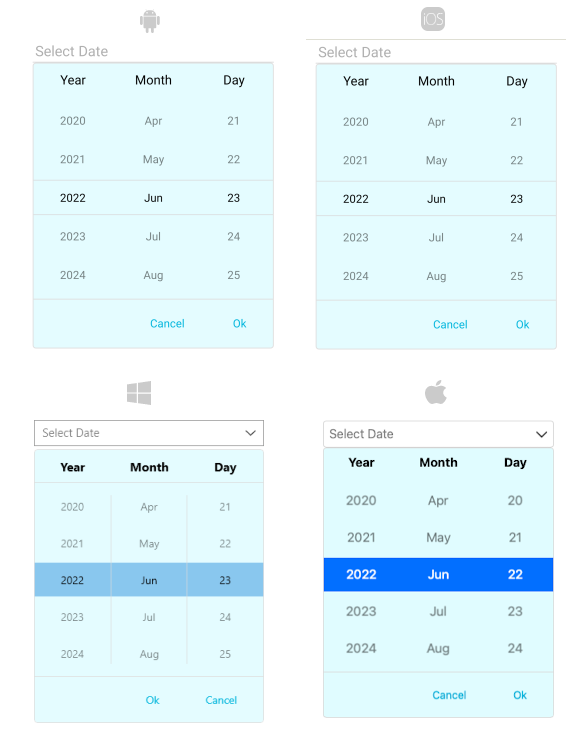
The following image shows a DatePicker control on different platforms after the styles have been applied to its drop-down: