.NET MAUI BusyIndicator Content
This article explains the content options of the BusyIndicator when the control is and isn't in a busy state.
When the control is not busy you can display a content using the Content(View) property.
The ContentUnderOpacity(double)—Defines the opacity when the indicator is busy. the content behind the indicator is visible. The default value is 0.
Busy Content
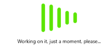
Setting the BusyContent property of BusyIndicator allows you to display any content together with the built-in animations while the control is in its Busy state.
Custom Busy Content
You can customize the BusyContentTemplate to arrange the custom content and the animated content per your choice.
The following example demonstrates how to customize the busy content.
1. Apply the BusyContent and BusyContentTemplate properties.
2. Add the telerik namespace:
The following image shows the result.