.NET MAUI BottomSheet Styling
The BottomSheet control offers styling options for both the main container, the bottom sheet content view, and its draggable handle component. You can customize colors, borders, corner radius, and dimensions to match your application's design requirements and create a polished user experience.
To style the BottomSheet control, use the Style property (Style with target type of RadBottomSheet).
To style the view of the BottomSheetContent, use the BottomSheetContentStyle property (Style with target type of telerik:BottomSheetContentView).
The available properties are described below:
-
BackgroundColor(Color)—Specifies the background color of the control. -
BorderColor(Color)—Specifies the border color around the control. -
BorderBrush(Brush)—Specifies the border brush around the control. -
BorderThickness(Thickness)—Specifies the border thickness around the control. -
CornerRadius(Thickness)—Specifies the corner radius of the border around the control.
Here is an example of the BottomSheet styling.
1. Define the BottomSheet in XAML:
<telerik:RadBottomSheet x:Name="bottomSheet"
                        Style="{StaticResource bottomSheetStyle}"
                        BottomSheetContentStyle="{StaticResource bottomSheetContentStyle}">
    <telerik:RadBottomSheet.Content>
        <telerik:RadCollectionView ItemsSource="{Binding People}"
                                   SelectionChanged="OnSelectionChanged"
                                   x:Name="peopleCollectionView">
            <telerik:RadCollectionView.ItemTemplate>
                <DataTemplate>
                    <Grid RowDefinitions="Auto, Auto"
                          Padding="{Binding Source={RelativeSource AncestorType={x:Type telerik:RadCollectionViewItemView}}, Path=ActualPadding}"
                          RowSpacing="3">
                        <HorizontalStackLayout>
                            <Label Text="Name: " />
                            <Label Text="{Binding Name}" />
                        </HorizontalStackLayout>
                        <HorizontalStackLayout Grid.Row="1">
                            <Label Text="Position: " />
                            <Label Text="{Binding Position}" />
                        </HorizontalStackLayout>
                    </Grid>
                </DataTemplate>
            </telerik:RadCollectionView.ItemTemplate>
            <telerik:RadCollectionView.ItemsLayout>
                <telerik:CollectionViewLinearLayout ItemSpacing="6" />
            </telerik:RadCollectionView.ItemsLayout>
        </telerik:RadCollectionView>
    </telerik:RadBottomSheet.Content>
    <telerik:RadBottomSheet.BottomSheetContent>
        <Grid RowDefinitions="Auto, Auto, Auto, Auto, Auto"
              Padding="20,0,0,0"
              ColumnDefinitions="100, *"
              RowSpacing="8">
            <Label Text="Country: "
                   FontAttributes="Bold" />
            <Label Text="{Binding Country}"
                   Grid.Column="1" />
            <Label Text="Age: "
                   FontAttributes="Bold"
                   Grid.Row="1" />
            <Label Text="{Binding Age}"
                   Grid.Row="1"
                   Grid.Column="1" />
            <Label Text="Department: "
                   FontAttributes="Bold"
                   Grid.Row="2" />
            <Label Text="{Binding Department}"
                   Grid.Row="2"
                   Grid.Column="1" />
            <Label Text="Company Id: "
                   FontAttributes="Bold"
                   Grid.Row="3" />
            <Label Text="{Binding CompanyID}"
                   Grid.Row="3"
                   Grid.Column="1" />
            <Label Text="Hired: "
                   FontAttributes="Bold"
                   Grid.Row="4" />
            <Label Text="{Binding Joined}"
                   Grid.Row="4"
                   Grid.Column="1" />
        </Grid>
    </telerik:RadBottomSheet.BottomSheetContent>
</telerik:RadBottomSheet>
2. Define the RadBottomSheet style in page's resources:
<Style x:Key="bottomSheetStyle" TargetType="telerik:RadBottomSheet">
    <Setter Property="BorderColor" Value="#00897B" />
    <Setter Property="BorderThickness" Value="1" />
</Style>
3. Define the BottomSheetContentView style in page's resources:
<Style x:Key="bottomSheetContentStyle" TargetType="telerik:BottomSheetContentView">
    <Setter Property="BackgroundColor" Value="#D6EEEC" />
    <Setter Property="BorderColor" Value="#00897B" />
    <Setter Property="BorderThickness" Value="1" />
</Style>
4. Add the telerik namespace:
xmlns:telerik="http://schemas.telerik.com/2022/xaml/maui"
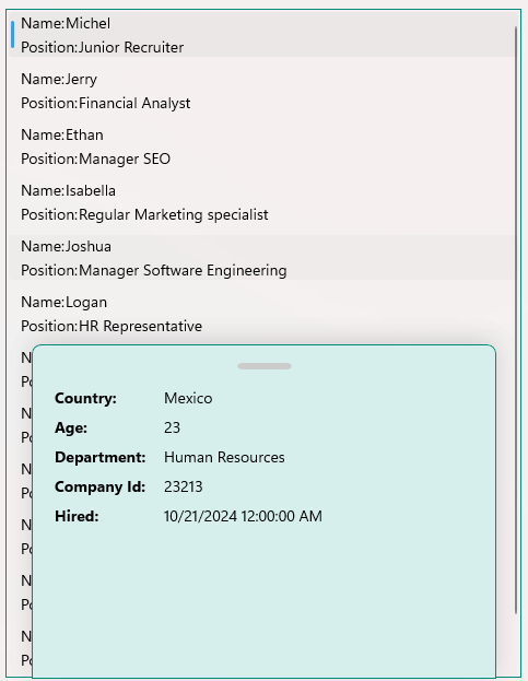
Here is the result of styling the BottomSheet and BottomSheetContent. The BottomSheetContent opens when tapping on an item from the CollectionView:
For a runnable example with the BottomSheet Style scenario, see the SDKBrowser Demo Application and go to BottomSheet > Styling category.
Styling the BottomSheet Handle
The handle of the BottomSheet is a small visual indicator at the top of the control that users can grab to drag and resize the panel. You can style the handle by setting the HandleStyle property to the RadBottomSheet. The target type of the HandleStyle is BottomSheetHandle.
The available properties are described below:
-
BackgroundColor(Color)—Specifies the background color of the control. -
BorderColor(Color)—Specifies the border color around the control. -
BorderBrush(Brush)—Specifies the border brush around the control. -
BorderThickness(Thickness)—Specifies the border thickness around the control. -
CornerRadius(Thickness)—Specifies the corner radius of the border around the control. -
WidthRequest(double)—Specifies the width of the handle. -
HeightRequest(double)—Specifies the height of the handle.
Here is an example of the BottomSheet handle styling.
1. Define the BottomSheet in XAML:
<telerik:RadBottomSheet x:Name="bottomSheet"
                        HandleStyle="{StaticResource handleStyle}">
    <telerik:RadBottomSheet.Content>
        <telerik:RadCollectionView ItemsSource="{Binding People}"
                                   SelectionChanged="OnSelectionChanged"
                                   x:Name="peopleCollectionView">
            <telerik:RadCollectionView.ItemTemplate>
                <DataTemplate>
                    <Grid RowDefinitions="Auto, Auto"
                          Padding="{Binding Source={RelativeSource AncestorType={x:Type telerik:RadCollectionViewItemView}}, Path=ActualPadding}"
                          RowSpacing="3">
                        <HorizontalStackLayout>
                            <Label Text="Name: " />
                            <Label Text="{Binding Name}" />
                        </HorizontalStackLayout>
                        <HorizontalStackLayout Grid.Row="1">
                            <Label Text="Position: " />
                            <Label Text="{Binding Position}" />
                        </HorizontalStackLayout>
                    </Grid>
                </DataTemplate>
            </telerik:RadCollectionView.ItemTemplate>
            <telerik:RadCollectionView.ItemsLayout>
                <telerik:CollectionViewLinearLayout ItemSpacing="6" />
            </telerik:RadCollectionView.ItemsLayout>
        </telerik:RadCollectionView>
    </telerik:RadBottomSheet.Content>
    <telerik:RadBottomSheet.BottomSheetContent>
        <Grid RowDefinitions="Auto, Auto, Auto, Auto, Auto"
                  Padding="20,0,0,0"
                  ColumnDefinitions="100, *"
                  RowSpacing="8">
            <Label Text="Country: "
                   FontAttributes="Bold" />
            <Label Text="{Binding Country}"
                   Grid.Column="1" />
            <Label Text="Age: "
                   FontAttributes="Bold"
                   Grid.Row="1" />
            <Label Text="{Binding Age}"
                   Grid.Row="1"
                   Grid.Column="1" />
            <Label Text="Department: "
                   FontAttributes="Bold"
                   Grid.Row="2" />
            <Label Text="{Binding Department}"
                   Grid.Row="2"
                   Grid.Column="1" />
            <Label Text="Company Id: "
                   FontAttributes="Bold"
                   Grid.Row="3" />
            <Label Text="{Binding CompanyID}"
                   Grid.Row="3"
                   Grid.Column="1" />
            <Label Text="Hired: "
                   FontAttributes="Bold"
                   Grid.Row="4" />
            <Label Text="{Binding Joined}"
                   Grid.Row="4"
                   Grid.Column="1" />
        </Grid>
    </telerik:RadBottomSheet.BottomSheetContent>
</telerik:RadBottomSheet>
2. Define the BottomSheetHandle style in page's resources:
<Style x:Key="handleStyle" TargetType="telerik:BottomSheetHandle">
    <Setter Property="BackgroundColor" Value="#00897B" />
    <Setter Property="HeightRequest" Value="6" />
    <Setter Property="CornerRadius" Value="3" />
    <Setter Property="WidthRequest" Value="50" />
</Style>
3. Add the telerik namespace:
xmlns:telerik="http://schemas.telerik.com/2022/xaml/maui"
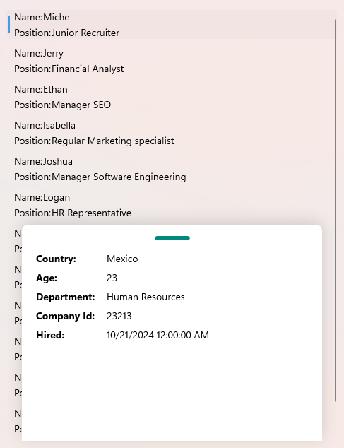
Here is the result of styling the handle. The BottomSheet content opens when tapping on an item from the CollectionView:
For a runnable example with the BottomSheet Handle Style scenario, see the SDKBrowser Demo Application and go to BottomSheet > Styling category.