.NET MAUI BottomSheet Configuration
The Telerik UI for .NET MAUI BottomSheet control offers flexible configuration options for states, dimensions, and visual elements. You can define custom states with specific heights, control the sheet's dimensions using absolute or percentage values, and customize the draggable handle to match your application's design.
States
The BottomSheet control provides a flexible state system that determines how much of the screen the component occupies. You can use predefined states or create custom ones to present content at different visibility levels.
Predefined States
The control includes four built-in states with predefined heights:
-
Hidden(default)—Represents a completely hidden bottom sheet. -
Minimal—Represents a minimal bottom sheet state with height25%. -
Partial—Represents a partial bottom sheet state with height50%. -
Full—Represents a full bottom sheet state with height90%.

Setting States
You can specify the current state using the State property of type BottomSheetState:
<telerik:RadBottomSheet x:Name="bottomSheet"
                        State="Partial">
    <!-- Content -->
</telerik:RadBottomSheet>
Custom States
You can control the generation of default states using the AutoGenerateStates (bool) property. The default value is true, which means the four predefined states are populated in the States collection.
<telerik:RadBottomSheet AutoGenerateStates="False" />
Create custom states using the BottomSheetState class constructors:
- Using
BottomSheetLength
public BottomSheetState(string name, BottomSheetLength height)
- Using
doublevalue
public BottomSheetState(string name, double size, bool isPercentage = false)
Example of creating custom states:
// Custom state with 30% height
var customState = new BottomSheetState("Custom", 30, true);

// Custom state with absolute height = 200
var fixedState = new BottomSheetState("Fixed", 200, false);
Programmatic State Changes
Use the GoToBottomSheetState(string name) method to programmatically change states:
Here is an example setting the predefined name of the state inside the GoToBottomSheetState(string name) method:
private void OnOpenClicked(object sender, System.EventArgs e)
{
    this.bottomSheet.GoToBottomSheetState(BottomSheetState.PartialStateName);
}
Here is an example setting a custom state:
// Navigate to custom states
var customState = new BottomSheetState("Custom", 30, true);
bottomSheet.GoToBottomSheetState("Custom");
States Collection
The BottomSheet provides a read-only States collection of type ObservableCollection<BottomSheetState> that contains all available states for the bottom sheet, including both predefined and custom states.
For a runnable example with setting the BottomSheet States, see the SDKBrowser Demo Application and go to BottomSheet > Features category.
Width
You can specify the width for the bottom sheet content using the BottomSheetContentWidth property of type BottomSheetLength. The BottomSheetLength structure supports both absolute and percentage values:
<!-- Percentage width -->
<telerik:RadBottomSheet BottomSheetContentWidth="80%">
    <!-- Content -->
</telerik:RadBottomSheet>

<!-- Absolute width -->
<telerik:RadBottomSheet BottomSheetContentWidth="300">
    <!-- Content -->
</telerik:RadBottomSheet>
// Using percentage
bottomSheet.BottomSheetContentWidth = new BottomSheetLength(80, true);

// Using absolute value
bottomSheet.BottomSheetContentWidth = new BottomSheetLength(300, false);
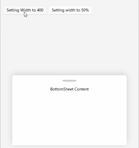
Here is an example setting the width of the BottomSheetContent to 400 (absolute value) and 50%:
For a runnable example with setting the BottomSheet Width, see the SDKBrowser Demo Application and go to BottomSheet > Features category.
Handle
The BottomSheet exposes a visual cue which indicates the control can be dragged. You can customize the handle by using the HandleStyle (Style with target type BottomSheetHandle) property.
For more details, review the BottomSheet Handle Styling article.