Items Indent
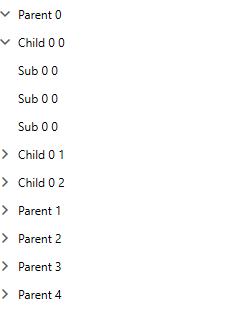
The RadTreeView allows you to control the indent of its items. You can do that by changing the value of the ItemsIndent property. The default value of this property is 20.
Example 1: Setting ItemsIndent Property
<telerik:RadTreeView ItemsIndent="0" ItemsSource="{Binding NodeColletion}" ItemTemplate="{StaticResource dataTemplate}"/>
Figure 1: Vertically Align TreeView Items

ExpanderButtonMinWidth
With the 2021 R1 SP1 version of Telerik UI for WPF, we have to introduce the ExpanderButtonMinWidth property of the RadTreeViewItem to control the width of the expander ToggleButton. This property has a different value depending on the theme.
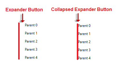
In Figure 1, the roots, and their nodes are vertically aligned. In a case when the nodes do not have children, the expander button will not be visible. Nevertheless, the expander ToggleButton is not visible. It still will occupy space depending on the ExpanderButtonMinWidth property value. To completely remove the button, you can set the ExpanderButtonMinWidth property to 0 and Collapsed the button. Example 2 demonstrate how you can do that through implicit style.
Example 2: Collapsed Expander Button
<Style TargetType="telerik:RadTreeViewItem" BasedOn="{StaticResource RadTreeViewItemStyle}">
    <Setter Property="ExpanderButtonMinWidth" Value="0" />
    <Setter Property="ExpanderStyle">
        <Setter.Value>
            <Style TargetType="ToggleButton">
                <Setter Property="Visibility" Value="Collapsed" />
            </Style>
        </Setter.Value>
    </Setter>
</Style>
Figure 2: Collapsed Expander Button

TreeView Lines and Item Indent
The control allows you to show connected lines between the nodes and their root nodes. More information regarding this feature can be found in the Lines Support topic.
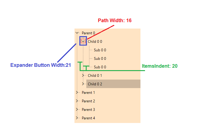
To correctly adjust the nodes' lines, the ItemsIndent and ExpanderButtonMinWidth properties need to be set. The ItemsIndent property needs to be at least the half size of the expander Button. On the other hand, the ExpanderButtonMinWidth needs to be set to an odd value bigger than the expander button width.
The expander path element has a different width in different themes.
Figure 3: Default Size of the Elements in Fluent Theme

In the above case, we will reduce the space by using the ItemsIndent and ExpanderButtonMinWidth properties. The ExpanderButtonMinWidth property can be set to an odd value bigger than the path's width. In our case, the minimum value will be 17.
Example 3: Set Compact View
<Window.Resources>
    <HierarchicalDataTemplate x:Key="dataTemplate" ItemsSource="{Binding Children}" >
        <TextBlock Text="{Binding Header}" />
    </HierarchicalDataTemplate>
    <Style TargetType="telerik:RadTreeViewItem" BasedOn="{StaticResource RadTreeViewItemStyle}">
        <Setter Property="ExpanderButtonMinWidth" Value="17"/>
    </Style>
</Window.Resources>
<Grid>
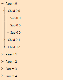
    <telerik:RadTreeView Background="Bisque" Loaded="RadTreeView_Loaded" ItemsIndent="9"  IsLineEnabled="True" IsRootLinesEnabled="True"  ItemsSource="{Binding NodeColletion}" ItemTemplate="{StaticResource dataTemplate}"/>
</Grid>
Figure 4: Compact TreeView Lines
