CheckBox Support
Telerik RadTreeView provides check boxes/radio buttons displayed next to each item. The RadTreeView allows the user to check/uncheck the nodes and to perform various tasks with the collection of checked nodes. Using the corresponding events, you can entirely handle the node-check action.
The purpose of this tutorial is to show you how to:
-
Enable check boxes next to each item - declaratively and programmatically.
Use the corresponding events to handle the check/uncheck action.
For the next tasks will be used the treeview shown on the next figure.
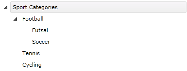
<telerik:RadTreeView Margin="8" x:Name="radTreeView">
    <telerik:RadTreeViewItem Header="Sport Categories">
        <telerik:RadTreeViewItem Header="Football">
            <telerik:RadTreeViewItem Header="Futsal"/>
            <telerik:RadTreeViewItem Header="Soccer"/>
        </telerik:RadTreeViewItem>
        <telerik:RadTreeViewItem Header="Tennis"/>
        <telerik:RadTreeViewItem Header="Cycling"/>
    </telerik:RadTreeViewItem>
</telerik:RadTreeView>
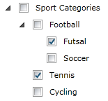
Enable Check Boxes Declaratively
RadTreeView provides check boxes displayed next to each item. In order to enable this behavior you need to set the IsOptionElementsEnabled property of the RadTreeView to True.
For example, add the following attribute to the treeview declaration in XAML:
<telerik:RadTreeView x:Name="radTreeView" IsOptionElementsEnabled="True">
Here is a snapshot of the result.
Enable Check Boxes Programmatically
You might want to enable check boxes in the code-behind. In order to do this, set the IsOptionElementsEnabled property of an instance of the RadTreeView class to True.
private void EnableCheckBoxes()
{
    radTreeView.IsOptionElementsEnabled = true;
}
Private Sub EnableCheckBoxes()
    radTreeView.IsOptionElementsEnabled = True
End Sub
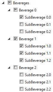
"Tri-state" Check Boxes
The Tri-State CheckBox mode of RadTreeView allows for RadTreeViewItems' CheckBoxes to have an additional, third state - Indeterminate. To enable it you need to set the IsTriStateMode property of the RadTreeView to True. When this mode is activated the CheckState property of each item depends on the CheckState property of its direct child items and its parent item. In this mode an item will be checked only if all of its child items are checked. The same item will be unchecked if all of its child items are unchecked. In all other combinations of states of its children the item will be in Indeterminate state. It is important to keep in mind that if a parent item is checked or unchecked all its child items will inherit that state. This also will force its parent (if any) to update its state. This will recursively propagate all the way to the root of the RadTreeView.
<telerik:RadTreeView x:Name="radTreeView" IsOptionElementsEnabled="True" IsTriStateMode="True">
The result can be seen on the next figure:
The "Tri-state" behavior can be activated in the code-behind too. To do so, set the IsTriStateMode property of an instance of the RadTreeView class to True.
radTreeView.IsTriStateMode = true;
radTreeView.IsTriStateMode = True
Please keep in mind that the RadTreeView 'tri-state' check boxes logic is desined to work in declaratively populated RadTreeView control. This is why if your applicaiton implements an MVVM approach and the RadTreeView is databound, it's best to define custom 'tri-state' logic in your ViewModels following this tutorial.
Accessing the CheckState Property of a RadTreeViewItem
To see the Item check state in the code-behind you should use the CheckState property of the RadTreeViewItem class. The CheckState property is a ToggleState enumeration and has the following values:
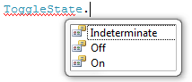
- On - the treeview item is checked.
-
Off - the treeview item is not checked.
-
Indeterminate - the treeview item has items that are checked and items that are not checked. This state is available only when the RadTreeView IsTriStateMode property is set to True.
The ToggleState enumeration is a part of the System.Windows.Automation namespace.
Accessing the initially checked item when using the "tri-state" check boxes
In order to access the initially checked item when the RadTreeView.IsTriStateMode property is set to True you should use the IsUserInitiated property of the RadTreeViewCheckEventArgs class. The IsUserInitiated property is a Boolean property that indicates whether the item is the initially checked one.
private void RadTreeViewItem_Checked(object sender, Telerik.Windows.RadRoutedEventArgs e)
{
 bool isInitiallyChecked = (e as RadTreeViewCheckEventArgs).IsUserInitiated;
}
Events
The RadTreeView and RadTreeViewItem classes offer you four events for managing the changes of the item check state. These events are available both on the RadTreeView and on the RadTreeViewItem classes.
<telerik:RadTreeView Margin="8" x:Name="radTreeView" IsOptionElementsEnabled="True"
        PreviewChecked="radTreeView_PreviewChecked"
        Checked="radTreeView_Checked"
        PreviewUnchecked="radTreeView_PreviewUnchecked"
        Unchecked="radTreeView_Unchecked">
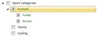
The PreviewChecked event occurs when the treeview item is about to be checked. The Checked event is fired when the treeview item is already checked. The type of the passed event arguments for both of the events is RadRoutedEventArgs. In the event handlers you can place some code. For example, the following lines of code will set the foreground of the checked node green:
private void radTreeView_Checked( object sender, RadRoutedEventArgs e )
{
    ( e.Source as RadTreeViewItem ).Foreground = new SolidColorBrush( Colors.Green );
}
Private Sub radTreeView_Checked(ByVal sender As Object, ByVal e As RadRoutedEventArgs)
    TryCast(e.Source, RadTreeViewItem).Foreground = New SolidColorBrush(Colors.Green)
End Sub
And here is the result:
The PreviewUnchecked event is fired when the treeview item is about to be unchecked. The Unchecked event occurs when the treeview item is unchecked. The type of the passed event arguments for both of the events is RadRoutedEventArgs.
The RadRoutedEventArgs class is part of the Telerik.Windows namespace.
For a full list of the exposed by the RadTreeView events, please refer to the Events - Overview topic.