WPF SplashScreen Overview
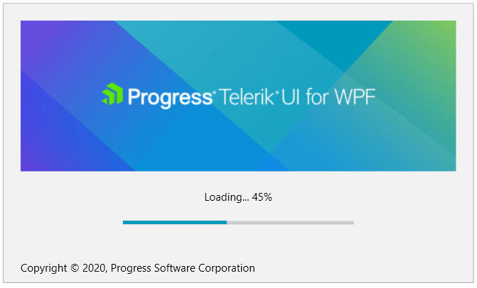
RadSplashScreen allows you to display a Telerik themed control that notifies the user that the program is loading. You can customize the image of the splash screen, its animations and loading process visualization.
The RadSplashScreen is part of Telerik UI for WPF, a
professional grade UI library with 160+ components for building modern and feature-rich applications. To try it out sign up for a free 30-day trial.
Key Features
Customizable image content: The control allows you to easily set the splash screen image. Read more in the Splash Screen Manager article.
Built-in progress bar: By default the control shows an indeterminate RadProgressBar. You can easily change this and indicate some loading progress. Read more in the Progress Bar article.
Customizable content/footer UI: You can customize the content/footer of the splash screen by defining a template or by only setting the Content/Footer properties.
Animations: The control comes with show and hide animations that can be modified, replaced or removed. Read more in the Animations article.
Rich set of themes: You can use the Telerik themes to modernize your UI or implement different designs that can be changed at runtime. Read more in the Setting a Theme article.
Get started with the control with its Getting Started help article that shows how to use it in a basic scenario.
Check out the online demo at demos.telerik.com.
Telerik UI for WPF Support and Learning Resources
- Telerik UI for WPF SplashScreen Homepage
- Get Started with the Telerik UI for WPF SplashScreen
- Telerik UI for WPF API Reference
- Getting Started with Telerik UI for WPF Components
- Telerik UI for WPF Virtual Classroom (Training Courses for Registered Users)
- Telerik UI for WPF SplashScreen Forums
- Telerik UI for WPF Knowledge Base