Navigation Buttons
The navigation buttons allow you to navigate through the data. RadSlideView provides the ability to control their visibility, position, and style. Furthermore, you can also specify an auto-hide period, after which the buttons will be automatically hidden, as well as enable or disable infinite scrolling.
Controlling the Visibility of the Buttons
The visibility of the navigation buttons is controlled via the ButtonVisibility property of RadSlideView. This property is of the type ButtonVisibility and it exposes the following options:
-
Collapsed—This option will prevent the buttons from showing. -
Visible—With this option, the buttons will be visible. -
VisibleOnMouseOver—This option is the default one. With it, the buttons will be visible when the mouse is over the RadSlideView control. -
HiddenWhenDisabled—When this option is chosen, each button will be hidden when it is in disabled state.
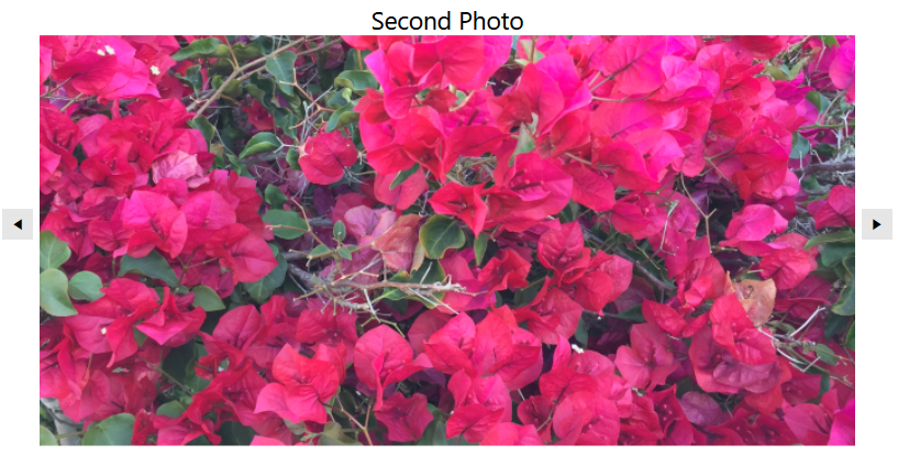
Setting the ButtonVisibility property to Visible
<telerik:RadSlideView ButtonVisibility="Visible"/>

Controlling the Position of the Navigation Buttons
RadSlideView allows you to control the navigation buttons' position. They can be displayed either over the content or next to it. This behavior is controlled via the ShowButtonsOverContent property. The default value is true, with which the buttons will be displayed over the content.
Setting the ShowButtonsOverContent property
<telerik:RadSlideView ShowButtonsOverContent="False"/>
Customizing the Appearance of the Navigation Buttons
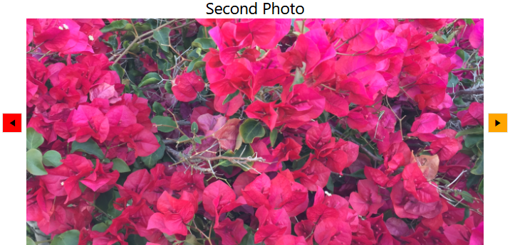
RadSlideView exposes the PreviousButtonStyle and NextButtonStyle properties that will allow you to set custom styles to the navigation buttons. Both buttons are of the type RadButton and the custom styles will have to target this type of element.
Setting custom styles to the PreviousButtonStyle and NextButtonStyle properties
<Grid>
    <Grid.Resources>
         <!--Set BasedOn property if NoXaml assemblies are used: BasedOn="{StaticResource SlideViewPreviousButtonStyle}"-->
        <Style x:Key="CustomSlideViewPreviousButtonStyle" TargetType="telerik:RadButton">
            <Setter Property="Background" Value="Red"/>
        </Style>
         <!--Set BasedOn property if NoXaml assemblies are used: BasedOn="{StaticResource SlideViewNextButtonStyle}"-->
        <Style x:Key="CustomSlideViewNextButtonStyle" TargetType="telerik:RadButton">
            <Setter Property="Background" Value="Orange"/>
        </Style>
    </Grid.Resources>
    <telerik:RadSlideView PreviousButtonStyle="{StaticResource CustomSlideViewPreviousButtonStyle}"
                          NextButtonStyle="{StaticResource CustomSlideViewNextButtonStyle}"/>
</Grid>
Setting an Auto-Hide Interval for the Navigation Buttons
You can specify a time interval, after which the navigation buttons will become hidden. This interval will begin after the mouse is out of the control or it stops moving when it's over it. To apply such a time interval, you can set theAutoHideButtonsDelay property of RadSlideView. This property has a type of nullable TimeSpan. By default, this property will be null and the buttons will not become hidden.
Setting an auto-hide interval for the navigation buttons
<telerik:RadSlideView AutoHideButtonsDelay="00:00:05"/>