Getting Started with WPF SlideView
This tutorial will walk you through the creation of a sample application that contains a RadSlideView control.
Adding Telerik Assemblies Using NuGet
To use RadSlideView when working with NuGet packages, install the Telerik.Windows.Controls.for.Wpf.Xaml package. The package name may vary slightly based on the Telerik dlls set - Xaml or NoXaml
Read more about NuGet installation in the Installing UI for WPF from NuGet Package article.
With the 2025 Q1 release, the Telerik UI for WPF has a new licensing mechanism. You can learn more about it here.
Adding Assembly References Manually
If you are not using NuGet packages, you can add a reference to the following assemblies:
- Telerik.Licensing.Runtime
- Telerik.Windows.Controls
Defining the RadSlideView
You can add RadSlideView manually in XAML as demonstrated in the following example:
Adding RadSlideView in XAML
<telerik:RadSlideView/>

Data Binding
RadSlideView allows you to data bind it to a collection of business objects. To do so, bind the collection to the ItemsSource property of the control.
The following example will demonstrate a simple data binding scenario.
Defining the model
public class Photo
{
    public string Title { get; set; }
    public string ImagePath { get; set; }
}
Public Class Photo
    Public Property Title As String
    Public Property ImagePath As String
End Class
Defining the view model
public class PhotosViewModel
{
public PhotosViewModel()
{
this.Photos = new ObservableCollection<Photo>()
{
new Photo() { Title = "First Photo", ImagePath = "FirstPhoto.png" },
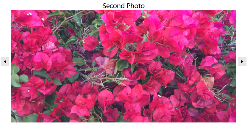
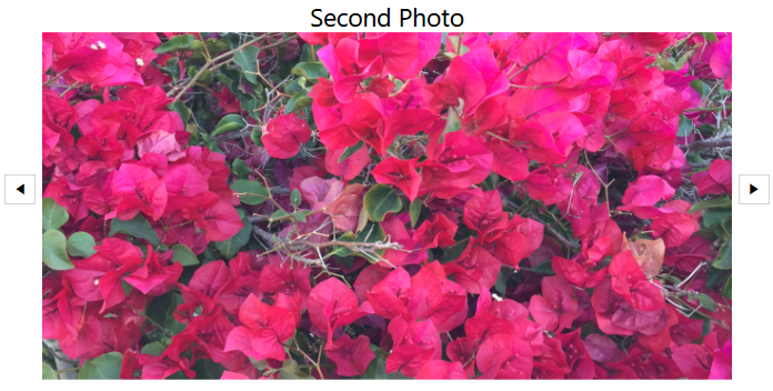
new Photo() { Title = "Second Photo", ImagePath = "SecondPhoto.png" },
new Photo() { Title = "Third Photo", ImagePath = "ThirdPhoto.png" },
};
}
public ObservableCollection<Photo> Photos { get; set; }
}
Public Class PhotosViewModel
    Public Sub New()
        Me.Photos = New ObservableCollection(Of Photo)() From {
            New Photo() With {
                .Title = "First Photo",
                .ImagePath = "FirstPhoto.png"
            },
            New Photo() With {
                .Title = "Second Photo",
                .ImagePath = "SecondPhoto.png"
            },
            New Photo() With {
                .Title = "Third Photo",
                .ImagePath = "ThirdPhoto.png"
            }
        }
    End Sub

    Public Property Photos As ObservableCollection(Of Photo)
End Class
Binding the collection to the ItemsSource property
<Grid>
    <Grid.Resources>
        <local:PhotosViewModel x:Key="PhotosViewModel"/>
    </Grid.Resources>
    <telerik:RadSlideView DataContext="{StaticResource PhotosViewModel}"
                          ItemsSource="{Binding Photos}">
    </telerik:RadSlideView>
</Grid>
Customizing the appearance of the bound items via the ItemTemplate property of RadSlideView
<Grid>
    <Grid.Resources>
        <local:PhotosViewModel x:Key="PhotosViewModel"/>
    </Grid.Resources>
    <telerik:RadSlideView DataContext="{StaticResource PhotosViewModel}"
                          ItemsSource="{Binding Photos}"
                          SelectedIndex="0"
                          ShowButtonsOverContent="False"
                          HorizontalAlignment="Center"
                          VerticalAlignment="Center">
        <telerik:RadSlideView.ItemTemplate>
            <DataTemplate>
                <Grid>
                    <Grid.RowDefinitions>
                        <RowDefinition Height="Auto"/>
                        <RowDefinition Height="*"/>
                    </Grid.RowDefinitions>
                    <TextBlock Text="{Binding Title}"
                               FontSize="18"
                               HorizontalAlignment="Center"
                               VerticalAlignment="Center"/>
                    <Image Source="{Binding ImagePath}" Grid.Row="1"/>
                </Grid>
            </DataTemplate>
        </telerik:RadSlideView.ItemTemplate>
    </telerik:RadSlideView>
</Grid>
Setting a Theme
The controls from our suite support different themes. You can see how to apply a theme different than the default one in the Setting a Theme help article.
Changing the theme using implicit styles will affect all controls that have styles defined in the merged resource dictionaries. This is applicable only for the controls in the scope in which the resources are merged.
Choose between the themes and add reference to the corresponding theme assembly (ex: Telerik.Windows.Themes.Windows8.dll). You can see the different themes applied in the Theming examples from our WPF Controls Examples application.
-
Merge the ResourceDictionaries with the namespace required for the controls that you are using from the theme assembly. For the RadSlideView, you will need to merge the following resources:
- Telerik.Windows.Controls
The following example demonstrates how to merge the ResourceDictionaries so that they are applied globally for the entire application.
Merge the ResourceDictionaries
<Application.Resources>
    <ResourceDictionary>
        <ResourceDictionary.MergedDictionaries>
            <ResourceDictionary Source="/Telerik.Windows.Themes.Windows8;component/Themes/System.Windows.xaml"/>
            <ResourceDictionary Source="/Telerik.Windows.Themes.Windows8;component/Themes/Telerik.Windows.Controls.xaml"/>
        </ResourceDictionary.MergedDictionaries>
    </ResourceDictionary>
</Application.Resources>
Alternatively, you can use the theme of the control via the StyleManager.
The following image shows a RadSlideView with the Windows8 theme applied.
RadSlideView with the Windows8 theme
Telerik UI for WPF Learning Resources
- Telerik UI for WPF SlideView Component
- Getting Started with Telerik UI for WPF Components
- Telerik UI for WPF Installation
- Telerik UI for WPF and WinForms Integration
- Telerik UI for WPF Visual Studio Templates
- Setting a Theme with Telerik UI for WPF
- Telerik UI for WPF Virtual Classroom (Training Courses for Registered Users)
- Telerik UI for WPF License Agreement