Styling the RadialMenu
This help topic will explain how you can customize the look of some of the elements of the RadialMenu control.
Before proceeding, please check Setting a Theme topic.
We will go through the following topics:
RadialMenu Style Properties
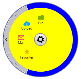
RadRadialMenu provides ContentMenuBackgroundStyle and NavigationMenuBackgroundStyle properties used to define the Background of the ContentMenu and NavigationMenu parts of the control. Their default values are respectively ContentMenuStyle and NavigationMenuStyle and receive as a TargetType a Rectangle element.
The following code snippets show how these properties can be customized.
Example 1: Define the Style properties
<UserControl.Resources>
    <Style x:Key="CustomContentMenuStyle" TargetType="Rectangle" BasedOn="{StaticResource ContentMenuStyle}">
        <Setter Property="Fill" Value="Yellow" />
    </Style>

    <Style x:Key="CustomNavigationMenuStyle" TargetType="Rectangle" BasedOn="{StaticResource NavigationMenuStyle}">
        <Setter Property="Fill" Value="Blue"/>
    </Style>
</UserControl.Resources>
Example 2: Set the Style properties to the RadialMenu
<telerik:RadRadialMenu ContentMenuBackgroundStyle="{StaticResource CustomContentMenuStyle}"
               NavigationMenuBackgroundStyle="{StaticResource CustomNavigationMenuStyle}">
    <!--...-->
</telerik:RadRadialMenu>
Customize the NavigationItemButtons Style
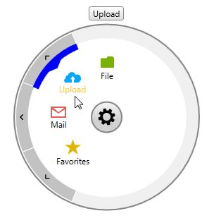
In order to change the way the navigation buttons look, you will need to create a Style with TargetType set to NavigationItemButton based on the default NavigationItemButtonStyle and modify the needed properties. Example 3 shows how you could change the Background, Foreground ( actually used for the arrow element) and Border colors.
Example 3: Customize the NavigationButtons
<UserControl.Resources>
    <Style TargetType="telerik:NavigationItemButton" BasedOn="{StaticResource NavigationItemButtonStyle}">
        <Setter Property="Background" Value="Yellow"/>
        <Setter Property="BorderBrush" Value="Orange"/>
        <Setter Property="Foreground" Value="Orange"/>
        <Setter Property="BorderThickness" Value="4"/>
    </Style>
</UserControl.Resources>
Customize the VisualStatesItemPresenter Style
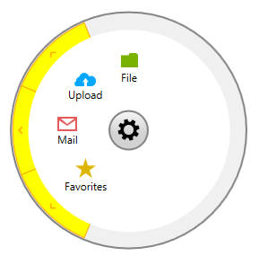
VisualStatesItemPresenter is the element used to mark the selected and highlighted RadialMenuItems. Again, to change its Style, you will need to add a new Style to your Resources with TargetType set to VisualStatesItemPresenter and based on the default VisualStatesItemPresenterStyle as shown in Example 4.
Example 4: Customize the VisualStatesItemPresenter
<UserControl.Resources>
    <Style TargetType="telerik:VisualStatesItemPresenter" BasedOn="{StaticResource VisualStatesItemPresenterStyle}">
        <Setter Property="Background" Value="Blue"/>
    </Style>
</UserControl.Resources>
Additionally, there are two more properties that you could set through the VisualStatesItemPresenterStyle:
ThicknessFactor - sets factor defining the thickness of the VisualStatesItemPresenter as a fraction of the size of the NavigationItemButton. The value should be between 0 and 1. If the passed value lies outside this range, it is automatically set to the nearest boundary value.
ArrowThicknessFactor - sets the factor defining the thickness of the arrow part of the VisualStatesItemPresenter as a fraction of the size of the NavigationItemButton. The value should be between 0 and 1. If the passed value lies outside this range, it is automatically set to the nearest boundary value.
Example 5 will show how these properties could be set:
Example 5: VisualStatesItemPresenter with customize Thickness and ArrowThickness
<UserControl.Resources>
    <Style TargetType="telerik:VisualStatesItemPresenter" BasedOn="{StaticResource VisualStatesItemPresenterStyle}">
        <Setter Property="Background" Value="Blue"/>
        <Setter Property="ThicknessFactor" Value="0.4" />
        <Setter Property="ArrowThicknessFactor" Value="0.5" />
    </Style>
</UserControl.Resources>