SelectedBackground and MouseOverBackground
The GridViewRow element exposes properties which allow you to change the default brush used for its selected and mouseover states. Those are SelectedBackground and MouseOverBackground.
SelectedBackground
RadGridView has a default Brush for its selection on row level depending on the given theme. For example, the visual appearance of the selected row in the Office2016 theme would be as shown below.
Figure 1: Selected Row Background in Office2016 Theme

As of R3 2018 RadGridView provides support for setting the background of its selected rows through the SelectedBackground property of GridViewRow.
Example 1: Setting the SelectedBackground property of GridViewRow
 <Style TargetType="telerik:GridViewRow">
        <Setter Property="SelectedBackground" Value="Bisque"/>
    </Style>
Figure 2: RadGridView with modified Background for its Selected Row

If you have alternating rows and you have explicitly set a style which sets the SelectedBackground of the rows to the RowStyle property of the RadGridView, you will have to set the AlternateRowStyle property to the same style (or a style that sets the SelectedBackground property to the same value).
In case the SelectionUnit of the RadGridView is Cell or Mixed, you can set the SelectedBackground property of the GridViewCell.
MouseOverBackground
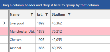
As of R1 2019 SP1, you are able to change the brush used for the mouseover state of the GridViewRow by setting its MouseOverBackground property as demonstrated in Example 2.
Example 2: Setting the MouseOverBackground property of GridViewRow
<Style TargetType="telerik:GridViewRow" >
    <Setter Property="MouseOverBackground" Value="Pink" />
</Style>
Figure 2: RadGridView with modified MouseOver Background

The notes in the previous section about the SelectedBackground property apply to the MouseOverBackground as well.