Pinned/Unpinned Panes
Each RadPane provides built-in pin/unpin functionality that allows you to control the behavior and the visualization of the docked RadPanes during run-time.
By default this functionality is enabled and when a RadPane is docked, pin/unpin toggle button is created and placed at its upper right corner. To toggle the pinned state of a certain RadPane just click the button, highlighted on Figure 1.
Figure 1: Pin button on a docked pane
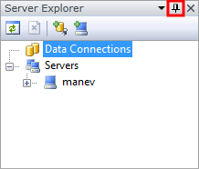
You can also change the pin state of a RadPane programmatically using the RadPane's boolean property IsPinned.
Example 1: Set the IsPinned property on a pane
<telerik:RadPane x:Name="radPane" IsPinned="True"/>
radPane.IsPinned = true;
radPane.IsPinned = True
You can also pin/unpin all of the panes inside of a RadPaneGroup using the methods group.PinAllPanes()/group.UnpinAllPanes().
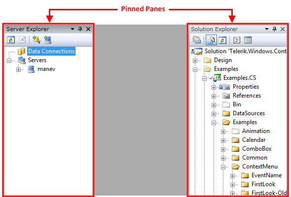
Pinned Panes
You can recognize that a docked RadPane is pinned if it is visible all the time, even if your mouse cursor is not over it. On the snapshot below you can see two pinned RadPanes docked to the left and to the right side of the docking container. Note that the pin icon of the toggle button is pointing downwards.
Unpinned Panes
The unpinned RadPane is shown only when the mouse cursor is over it and is hidden when the cursor leaves its area. When it is hidden you can only see its tab header placed in the auto-hide area, while when shown, it is slided on the top of all the other controls without affecting the overall layout.
On the snapshot below you can see two unpinned RadPanes; the first is a "Toolbox" docked to the left, the second is a "Solution Explorer" docked respectively to the right. You can see that all their content is hidden, except their tab headers placed in the auto-hide area.
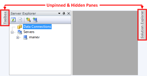
If you hover your mouse over the tab of the "Toolbox" pane, it will slide automatically overlapping the other content. Note that the pin icon of the toggle button is pointing sideways.
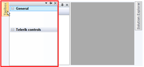
If you want to control the auto-hide area's width and hight of your unpinned panes use the respective RadPane's properties AutoHideHeight and AutoHideWidth. The size of the auto-hide area is also affected by the FlyoutMinLength property of RadDocking.
Let Auto-Hide Area Content Exceed Screen
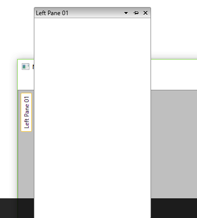
As the element hosting the content of the pane when you hover over the auto-hide area is a popup, it will try to position itself optimally so that all of it's content is displayed. An example of this behavior when such a popup is opened near the edge of the screen is illustrated in Figure 2.
Figure 2: Default unpinned pane near the edge of the screen
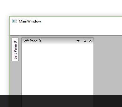
If, however, you want to force the panes to go outside of the screen, you can set the CanAutoHideAreaExceedScreen property of the RadDocking control to True. The result in such a scenario can be observed in Figure 3.
Figure 3: Unpinned pane near the edge of the screen with CanAutoHideAreaExceedScreen set to True
Disabling Pin
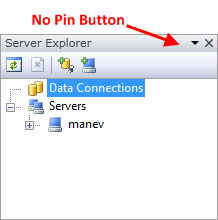
If you don't want your RadPanes to be pinnable just set the CanUserPin property to False. Once disabled the user will not be able to change the pin state of a RadPane run-time because the toggle button will be hidden. This has been illustrated in Figure 4.
Figure 4: Docked pane with no pin button
Example 2: Disable pinning of panes via the CanUserPin property
<telerik:RadPane x:Name="radPane1" CanUserPin="False"/>
radPane.CanUserPin = false;
radPane.CanUserPin = False