Styling the Clock
To style the clock in your RadDateTimePicker you can do the following:
Create a Style for it and set it to the ClockStyle property of the RadDateTimePicker.
Modify the default resources for the DateTimePickerClock, that are generated together with the RadDateTimePicker's Style.
To learn how to generate the default Style for the RadDateTimePicker read here. To learn how to modify the layout of the calendar, look here.
Setting the ClockStyle property
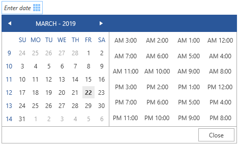
Example 1 demonstrates how the flow direction the RadClock in the dropdown of the RadDateTimePicker can be switched:
Example 1: RadDateTimePicker with ClockStyle
<Window.Resources>
    <!-- If you are using the Xaml binaries, you do not have to set the BasedOn attribute-->

    <Style x:Key="ClockStyle" TargetType="telerik:RadClock" BasedOn="{StaticResource RadClockStyle}">
        <Setter Property="FlowDirection" Value="RightToLeft" />
    </Style>
</Window.Resources>
<Grid>
    <telerik:RadDateTimePicker VerticalAlignment="Center" HorizontalAlignment="Center"  ClockStyle="{StaticResource ClockStyle}" />
</Grid>
Figure 1: Result from Example 1 in the Office2016 theme

Modifying the default resources
In order to see these resource you have to first generate the default style for the RadDateTimePicker control. To learn how read this topic.
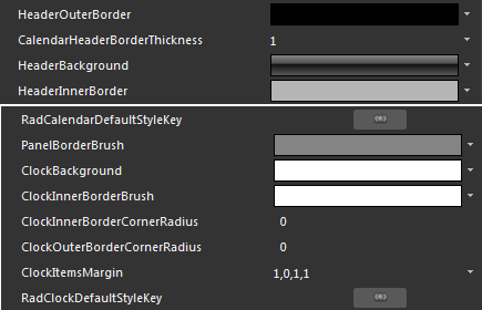
Modifying some of the resources generated for the RadDateTimePicker's style will allow you to change the appearance of the clock. Here are some of the resources:

HeaderOuterBorder - represents the RadDateTimePicker content's header outer border brush.
CalendarHeaderBorderThickness - represents the described above border's thickness.
HeaderBackground - corresponds to the RadDateTimePicker content's header background.
HeaderInnerBorder - represents the RadDateTimePicker content's header inner border brush.
PanelBorderBrush - is the BorderBrush used to outline the clock view.
ClockBackground - is the brush used as a background to the clock view.
ClockInnerBorderBrush - is the inner border brush applied to the clock view.
ClockInnerBorderCornerRadius - represents the inner border's corner radius of the RadDateTimePicker's clock view.
ClockOuterBorderCornerRadius - represents the outer border's corner radius of the RadDateTimePicker's clock view.
ClockItemsMargin - is the Thickness applied to each item in the clock view.
RadClockDefaultStyleKey - defines the clock's default style which includes some of the above properties.
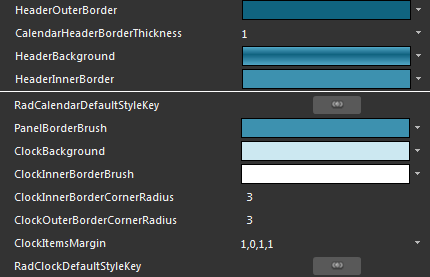
Here is an example of the above resources modified:

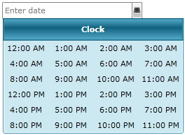
Here is the result:
