WPF DateTimePicker Overview
Thank you for choosing Telerik RadDateTimePicker!
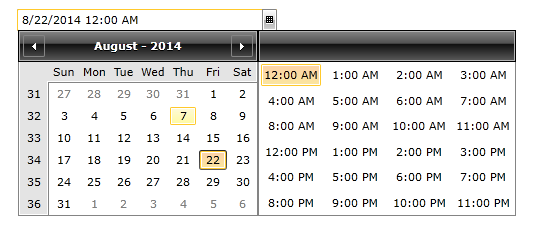
RadDateTimePicker is a convenient way to get rid of the boring date and time parsing and data validation. RadDateTimePicker is an easy and simple, but yet essential way to improve end-user experience. By setting the InputMode property you can use RadDateTimePicker as a DatePicker, TimePicker or both. Moreover, you can control the layout of the popups that show time and/or date values as well as use the rich data model in WPF to populate content dynamically.
The RadDateTimePicker is part of Telerik UI for WPF, a
professional grade UI library with 160+ components for building modern and feature-rich applications. To try it out sign up for a free 30-day trial.

Key Features
This is a list with short descriptions of the top-of-the-line features of the Telerik RadDateTimePicker control:
DatePicker and TimePicker controls: DatePicker and TimePicker are both incorporated in the RadDateTimePicker control. You can choose to use either one or both. Read more
Display Modes: You can display the DateTimePicker in four different views - Months, Years, Decades and Centuries. Thus, you can adjust the date-time-picker component to meet your very own business needs. Read more
Powerful Databinding: The WPF DateTimePicker control by Telerik can be bound to various datasource types, such as Object, XML and WCF services.
Keyboard Navigation: RadDateTimePicker supports the standard browser navigation paradigm. Once the control has focus, you can press the Down Arrow key to show the calendar. The users can go forward/backward over the individual days by pressing the arrow keys. Pressing the Tab key will move the focus to the time-picker where you can once again navigate. Tabbing again will focus the Close button which will close the picker. Read more
Advanced Parser: You can enter any number or string in the input field of RadDateTimePicker and the entered value will be transformed to a valid date. For example, if you type "1", the first day of the month will be shown after leaving the input field. Read more
Styling and Appearance: Telerik WPF RadDateTimePicker can be fully customized using Expression Blend. There are also several pre-defined themes that can be used to style the control. Read more
Enhanced Routed Events Framework: To help your code become even more elegant and concise, we implemented an Enhanced Routed Events Framework for the controls from the UI for WPF suite. This gives you more freedom when you design your applications since you can write instance handlers as well as class handlers for the routed events of our controls. Read more
Watermark: The DateTimePicker control allows the user to define and use watermarks in the date and time fields. Read more
Get started with the control with its Getting Started help article that shows how to use it in a basic scenario.
Check out the RadDateTimePicker demos at: https://demos.telerik.com/wpf/
Telerik UI for WPF Support and Learning Resources
- Telerik UI for WPF DateTimePicker Homepage
- Get Started with the Telerik UI for WPF DateTimePicker
- Telerik UI for WPF API Reference
- Getting Started with Telerik UI for WPF Components
- Telerik UI for WPF Virtual Classroom (Training Courses for Registered Users)
- Telerik UI for WPF DateTimePicker Forums
- Telerik UI for WPF Knowledge Base