Visual Structure
This section defines terms and concepts used in the scope of RadDateRangePicker that you need to get familiar with prior to continue reading this help. They can also be helpful when contacting our support service in order to describe your issue better. Below you can see snapshots and explanations of the main states and visual elements of the standard RadDateTimePicker control.
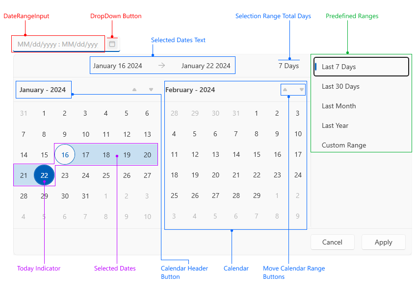
Date Range Input—Textbox input that displays the selection range.
Drop Down Button—Button that opens the drop down with the calendars.
Selected Dates Text—Text area that displays the from/to dates range.
Selection Range Total Days—The total number of selected days.
Predefined Ranges—List of predefined ranges that allows easier selection of commonly used ranges.
Today Indicator—Indicator that shows the current day.
Selected Dates—Highlight that shows the current selection.
Calendar Header Button—Button that displays the current month or year. It can be pressed to change the current calendar view.
Calendar—Calendar showing the dates. There are two calendars in the control placed next to each other - one for the current month and one for the next month.
Move Calendar Range Buttons—Buttons that change the current range of the calendar.