Customizing Appearance
DateRangePicker provides several properties that can be used to customize its appearance.
Showing Week Names and Numbers in the Calendar
By default the calendars in the drop down display only the day numbers, but the week number and dates can be shown as well. To do that, use the AreWeekNamesVisible and AreWeekNumbersVisible properties of RadDateRangePicker.
Setting the AreWeekNumbersVisible and AreWeekNamesVisible properties
<telerik:RadDateRangePicker AreWeekNamesVisible="True" AreWeekNumbersVisible="True" />
Customizing the Clear Button
The clear button is displayed on hover of the text input area. The button can be hidden by setting the IsClearButtonVisible property the of RadDateRangePicker to false.
Setting the IsClearButtonVisible property
<telerik:RadDateRangePicker IsClearButtonVisible="False"/>
ClearButtonStyle property. The property expects a Style object with its target type set to RadButton.
Using the ClearButtonStyle property
<Grid>
    <!-- if you use the NoXaml dlls and the Implicit Styles theming mechanism you don't need this ResourceDictionary -->
    <Grid.Resources>
        <ResourceDictionary Source="/Telerik.Windows.Controls.Input;component/Themes/GenericWindows11.xaml"/>
    </Grid.Resources>

    <telerik:RadDateRangePicker>
        <telerik:RadDateRangePicker.ClearButtonStyle>
            <Style TargetType="telerik:RadButton" BasedOn="{StaticResource DateRangeMaskedInputClearButtonStyle}">
                <Setter Property="Foreground" Value="White"/>
                <Setter Property="Background" Value="Purple"/>
                <Setter Property="Padding" Value="10"/>
            </Style>
        </telerik:RadDateRangePicker.ClearButtonStyle>
    </telerik:RadDateRangePicker>
</Grid>

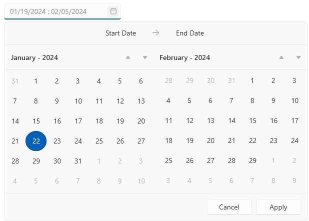
Hiding the Top Bar and Header
The top bar visual in the drop down displays the selected dates and their total number. To hide the top bar, set the IsTopBarVisible property of RadDateRangePicker to false.
Setting the IsTopBarVisible property
<telerik:RadDateRangePicker IsTopBarVisible="False"/>
The header visuals in the drop down display the current view (month or year) of each calendar, along with the arrow buttons for changing the current view range. To hide the headers, set the HeaderVisibility property of RadDateRangePicker to Collapsed or Hidden.
Setting the HeaderVisibility property
<telerik:RadDateRangePicker HeaderVisibility="Collapsed"/>
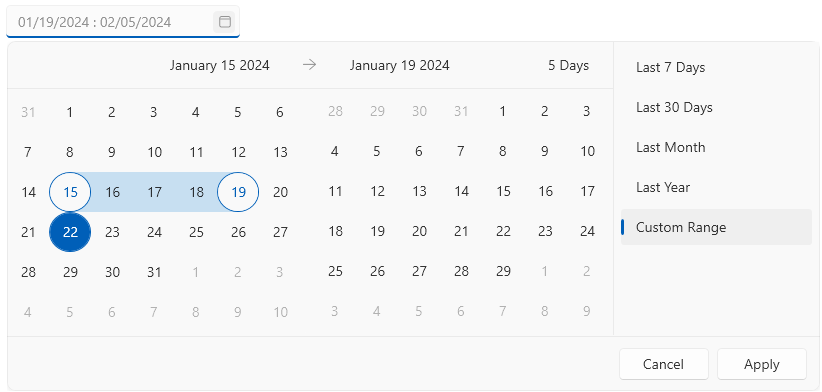
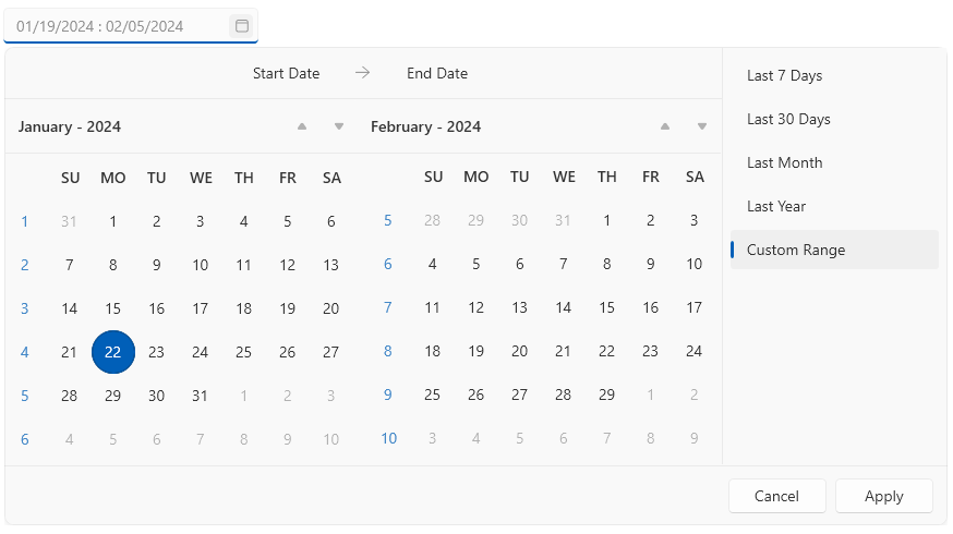
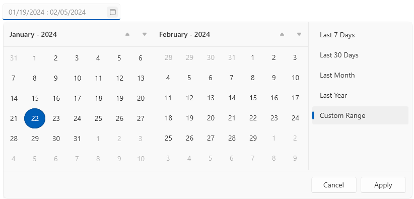
Hiding the Custom Ranges Panel
The custom ranges panel is displayed next to the calendars in the drop down. To hide this panel, set the IsDefaultRangesPanelVisible property of RadDateRangePicker.
Setting the IsDefaultRangesPanelVisible property
<telerik:RadDateRangePicker IsDefaultRangesPanelVisible="False"/>