DateRangePicker Overview
The DateRangePicker component allows you to easily enrich your UI with a tool for selecting range of dates. This is helpful for scenarios where you need to extract a specific set of data related to a time range. For example, applications for booking hotels, showing graphs with sales data in specific ranges and more.
The RadDateRangePicker is part of Telerik UI for WPF, a
professional grade UI library with 160+ components for building modern and feature-rich applications. To try it out sign up for a free 30-day trial.
Key Features
Culture settings—RadDateRangePicker provides settings to adjust the current culture and few corresponding options, like the first day of the week.
Read-only support—The component can be displayed in a read-only state that disables the user selection of dates.
Allowed selection range—You can define an allowed selection range which restricts the user selection.
Blackout dates—This features can be used to disable a set of dates which cannot be selected.
Customizable input element—The DateRangePicker control allows you to customize the formatting, the empty content and the placeholders of the input area.
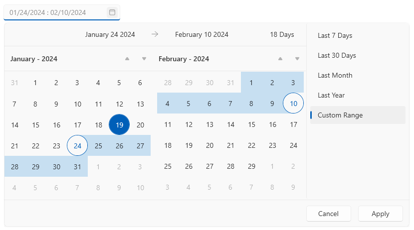
Customizable calendars—The control has a set of two calendars that show the current and next month or year, which can be customized via number of properties of the control.
Customizable list of predefined date ranges—The list with the predefined date ranges allows the end user to easily select a range.
Get started with the control with its Getting Started help article that shows how to use it in a basic scenario.
Check out the DateRangePicker demos at: https://demos.telerik.com/wpf/
Telerik UI for WPF Support and Learning Resources
- Telerik UI for WPF DateRangePicker Homepage
- Get Started with the Telerik UI for WPF DateRangePicker
- Telerik UI for WPF API Reference
- Getting Started with Telerik UI for WPF Components
- Telerik UI for WPF Virtual Classroom (Training Courses for Registered Users)
- Telerik UI for WPF DateRangePicker Forums
- Telerik UI for WPF Knowledge Base