Enable\Disable RadComboBoxItems
The purpose of this tutorial is to show you how to enable and disable RadComboBoxItems. The following sections are included:
Enable\Disable RadComboBox with Static Data
In the simplest scenario you will have a RadComboBox populated with static data in XAML.
Example 1: Populate with static data
<telerik:RadComboBox x:Name="radComboBox" Width="200">
<telerik:RadComboBoxItem Content="Alapattah"/>
<telerik:RadComboBoxItem Content="Brickell Avenue" />
<telerik:RadComboBoxItem Content="Downtown Miami" />
</telerik:RadComboBox>
The RadComboBox and RadComboBoxItem classes expose a property named IsEnabled. Set this property to False, when you want to disable either the whole RadComboBox or specific RadComboBoxItems. The next code-snippet shows you how to do that.
Example 2: Disabling specific RadComboBoxItems using the IsEnabled property
<telerik:RadComboBox x:Name="radComboBox" Width="200">
<telerik:RadComboBoxItem Content="Alapattah" IsEnabled="False"/>
<telerik:RadComboBoxItem Content="Brickell Avenue" />
<telerik:RadComboBoxItem Content="Downtown Miami" IsEnabled="False"/>
</telerik:RadComboBox>
Figure 1: Result of Example 2
Enable\Disable Items Using ItemContainerStyle
Using RadComboBox with static data is the simplest scenario. However, in most of the cases you will have a RadComboBox populated with a collection of business objects. In this case you have no other options except for using either the ItemContainerStyle or the ItemContainerStyleSelector.
Example 3: Create a collection of objects
public class Item : ViewModelBase
{
public int Id { get; set; }
public string Text { get; set; }
}
Example 4: Create the ViewModel
public class MainViewModel : ViewModelBase
{
private ObservableCollection<Item> items;
public ObservableCollection<Item> Items
{
get
{
if (this.items == null)
{
this.items = new ObservableCollection<Item>();
for (int i = 0; i < 20; i++)
{
this.items.Add(new Item() { Id = i, Text = "Item " + i });
}
}
return this.items;
}
}
}
Example 5: Set the ItemContainerStyle of a RadComboBox
<Window.DataContext>
<local:MainViewModel/>
</Window.DataContext>
<UserControl.Resources>
<Style x:Key="ItemContainerStyle" TargetType="telerik:RadComboBoxItem">
<Setter Property="IsEnabled" Value="False"/>
</Style>
</UserControl.Resources>
<telerik:RadComboBox x:Name="radComboBox"
Width="200"
ItemsSource="{Binding Items}"
DisplayMemberPath="Text"
ItemContainerStyle="{StaticResource ItemContainerStyle}"/>
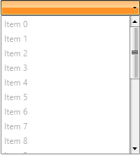
Note that in this case all RadComboBoxItems will be disabled. However, you have the ability to determine which items to be disabled based on your custom logic. Check out the next section to see the solution.
Figure 2: Result of Example 5
Enable\Disable Items Using ItemContainerStyleSelector
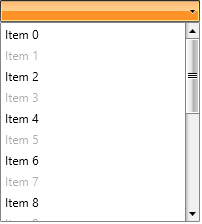
The StyleSelector provides a way to apply styles based on custom logic.
The next example demonstrates you how to achieve this.
Example 6: Create a custom logic class
public class EnableDisableSelector : StyleSelector
{
public Style EnableStyle { get; set; }
public Style DisableStyle { get; set; }
public override Style SelectStyle(object item, DependencyObject container)
{
if ((item as Item).Id % 2 == 1)
return this.DisableStyle;
else
return this.EnableStyle;
}
}
Example 7: Apply styles based on custom logic
<UserControl.Resources>
<Style x:Key="EnableStyle" TargetType="telerik:RadComboBoxItem">
<Setter Property="IsEnabled" Value="True"/>
</Style>
<Style x:Key="DisableStyle" TargetType="telerik:RadComboBoxItem">
<Setter Property="IsEnabled" Value="False"/>
</Style>
<example:EnableDisableSelector x:Key="StyleSelector" EnableStyle="{StaticResource EnableStyle}"
DisableStyle="{StaticResource DisableStyle}"/>
</UserControl.Resources>
<telerik:RadComboBox x:Name="radComboBox"
Width="200"
ItemsSource="{Binding Items}"
DisplayMemberPath="Text"
ItemContainerStyleSelector="{StaticResource StyleSelector}"/>
Figure 3: The result is that every odd item is disabled
Using Style Binding
Using ItemContainerStyle is a good solution, however, it is not the best. Imagine that your business object has a boolean property named IsEnabled. Even more flexible solution is to directly bind the RadComboBoxItem's IsEnabled property to the IsEnabled property exposed by your domain object. You can do this through style binding.
Example 8: Use of style binding
<UserControl.Resources>
<Style x:Key="ItemContainerStyle" TargetType="{x:Type telerik:RadComboBoxItem}">
<Setter Property="IsEnabled" Value="{Binding IsEnabled}"/>
</Style>
</UserControl.Resources>
<telerik:RadComboBox x:Name="radComboBox"
Width="200"
ItemsSource="{Binding Items}"
ItemTemplate="{StaticResource CustomItemTemplate}"
ItemContainerStyle="{StaticResource ItemContainerStyle}"/>
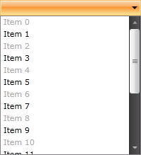
Two things should be mentioned here. First, note how the IsEnabled property is bound in the Style. Second, the declared Style is set as a ItemContainerStyle of the RadComboBox. The result is shown on the image below.