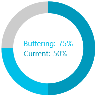
Secondary Progress Indicator
RadCircularProgressBar allows you to visualize a second progress indicator. This is intended for scenarios where the primary indicator depends on the process of the secondary one. To display the second progress indicator, set the SecondaryValue property.
Setting the SecondaryValue property
<telerik:RadCircularProgressBar Name="radCircularProgressBar"
                                Minimum="0"
                                Maximum="100"
                                Value="50"
                                SecondaryValue="75">
    <telerik:RadCircularProgressBar.Content>
        <Grid>
            <Grid.RowDefinitions>
                <RowDefinition Height="Auto"/>
                <RowDefinition Height="*"/>
            </Grid.RowDefinitions>
            <StackPanel Orientation="Horizontal">
                <TextBlock Text="Buffering:"
                           Foreground="{Binding ElementName=radCircularProgressBar, Path=SecondaryIndicatorFill}"/>
                <TextBlock Text="{Binding ElementName=radCircularProgressBar, Path=SecondaryValue, StringFormat={}{0}%}"
                           Foreground="{Binding ElementName=radCircularProgressBar, Path=SecondaryIndicatorFill}" Margin="5 0 0 0"/>
            </StackPanel>
            <StackPanel Grid.Row="1" Orientation="Horizontal">
                <TextBlock Text="Current:"
                           Foreground="{Binding ElementName=radCircularProgressBar, Path=IndicatorFill}"/>
                <TextBlock Text="{Binding ElementName=radCircularProgressBar, Path=Value, StringFormat={}{0}%}"
                           Foreground="{Binding ElementName=radCircularProgressBar, Path=IndicatorFill}" Margin="5 0 0 0"/>
            </StackPanel>
        </Grid>
    </telerik:RadCircularProgressBar.Content>
</telerik:RadCircularProgressBar>
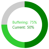
Primary and Secondary Progress Indicator Colors
You can colorize the primary and secondary progress indicators of the control. To do so, set the IndicatorFill and SecondaryIndicatorFill properties.
Setting the IndicatorFill and SecondaryIndicatorFill properties
<telerik:RadCircularProgressBar Name="radCircularProgressBar"
                                Minimum="0"
                                Maximum="100"
                                Value="50"
                                SecondaryValue="75"
                                IndicatorFill="Green"
                                SecondaryIndicatorFill="LimeGreen"/>