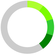
Color Ranges
RadCircularProgressBar supports setting different color ranges for the progress indicator. This is done by adding ProgressBarColorRange instances to the control's ColorRanges collection. To specify the start and end ranges of ProgressBarColorRange, set the Start and End properties. These properties are of type double. To specify the color for the color range, set its Color property.
The secondary indicator and segments are not supported when having color ranges.
RadCircularProgressBar with multiple color ranges
<telerik:RadCircularProgressBar Value="0.4">
    <telerik:RadCircularProgressBar.ColorRanges>
        <telerik:ProgressBarColorRange Color="GreenYellow" Start="0" End="0.1"/>
        <telerik:ProgressBarColorRange Color="LawnGreen" Start="0.1" End="0.2"/>
        <telerik:ProgressBarColorRange Color="LimeGreen" Start="0.2" End="0.3"/>
        <telerik:ProgressBarColorRange Color="Green" Start="0.3" End="0.4"/>
    </telerik:RadCircularProgressBar.ColorRanges>
</telerik:RadCircularProgressBar>
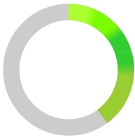
Gradient Colors
ProgressBarColorRange class allows you to set its fill to be a gradient. To do so, set the IsGradient property to True.
The following sample extends the implementation of the above example:
Setting the IsGradient property
<telerik:RadCircularProgressBar.ColorRanges>
    <telerik:ProgressBarColorRange Color="GreenYellow" Start="0" End="0.1" IsGradient="True"/>
    <telerik:ProgressBarColorRange Color="LawnGreen" Start="0.1" End="0.2" IsGradient="True"/>
    <telerik:ProgressBarColorRange Color="LimeGreen" Start="0.2" End="0.3" IsGradient="True"/>
    <telerik:ProgressBarColorRange Color="Green" Start="0.3" End="0.4" IsGradient="True"/>
</telerik:RadCircularProgressBar.ColorRanges>