Getting Started with WPF Calendar
This tutorial will walk you through the creation of a sample application that contains a RadCalendar.
Adding Telerik Assemblies Using NuGet
To use RadCalendar when working with NuGet packages, install the Telerik.Windows.Controls.Input.for.Wpf.Xaml package. The package name may vary slightly based on the Telerik dlls set - Xaml or NoXaml
Read more about NuGet installation in the Installing UI for WPF from NuGet Package article.
With the 2025 Q1 release, the Telerik UI for WPF has a new licensing mechanism. You can learn more about it here.
Adding Assembly References Manually
If you are not using NuGet packages, you can add a reference to the following assemblies:
- Telerik.Licensing.Runtime
- Telerik.Windows.Controls
- Telerik.Windows.Controls.Input
Adding RadCalendar to the Project
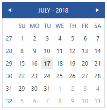
Example 1 demonstrates how you can add a RadCalendar in xaml.
Example 1: RadCalendar definition
<telerik:RadCalendar VerticalAlignment="Center" HorizontalAlignment="Center" />
Figure 1: Result from Example 1 in the Office2016 Theme
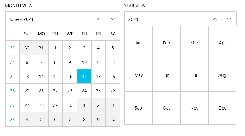
Changing the number of shown months
You can control how many months are shown by setting the Columns property of the RadCalendar. Its default value is one and the maximum is four. Example 2 demonstrates how you can achieve that.
Example 2: RadCalendar showing four months
<telerik:RadCalendar VerticalAlignment="Center" HorizontalAlignment="Center" Columns="4" ViewsHeaderVisibility="Visible"/>
Figure 2: Result from Example 2 in the Office2016 Theme

Hide Week Numbers and Weekdays
You have the option to hide the week numbers, as well as the weekdays. This can be done by setting the AreWeekNumbersVisible and AreWeekNamesVisible properties to False. Example 3 demonstrates this:
Example 3: RadCalendar without week numbers and weekdays
<telerik:RadCalendar VerticalAlignment="Center" HorizontalAlignment="Center" AreWeekNumbersVisible="False" AreWeekNamesVisible="False" />
Figure 3: Result from Example 3 in the Office2016 Theme

Setting a Theme
The controls from our suite support different themes. You can see how to apply a theme different than the default one in the Setting a Theme help article.
Changing the theme using implicit styles will affect all controls that have styles defined in the merged resource dictionaries. This is applicable only for the controls in the scope in which the resources are merged.
To change the theme, you can follow the steps below:
Choose between the themes and add reference to the corresponding theme assembly (ex: Telerik.Windows.Themes.Fluent.dll). You can see the different themes applied in the Theming examples from our WPF Controls Examples application.
-
Merge the ResourceDictionaries with the namespace required for the controls that you are using from the theme assembly. For the RadCalendar, you will need to merge the following resources:
- Telerik.Windows.Controls
- Telerik.Windows.Controls.Input
Example 3 demonstrates how to merge the ResourceDictionaries so that they are applied globally for the entire application.
Example 3: Merge the ResourceDictionaries
<Application.Resources>
    <ResourceDictionary>
        <ResourceDictionary.MergedDictionaries>
            <ResourceDictionary Source="/Telerik.Windows.Themes.Fluent;component/Themes/System.Windows.xaml"/>
            <ResourceDictionary Source="/Telerik.Windows.Themes.Fluent;component/Themes/Telerik.Windows.Controls.xaml"/>
            <ResourceDictionary Source="/Telerik.Windows.Themes.Fluent;component/Themes/Telerik.Windows.Controls.Input.xaml"/>
        </ResourceDictionary.MergedDictionaries>
    </ResourceDictionary>
</Application.Resources>
Alternatively, you can use the theme of the control via the StyleManager.
Figure 4 shows a RadCalendar with the Fluent theme applied.
Figure 4: RadCalendar with the Fluent theme
Telerik UI for WPF Learning Resources
- Telerik UI for WPF Calendar Component
- Getting Started with Telerik UI for WPF Components
- Telerik UI for WPF Installation
- Telerik UI for WPF and WinForms Integration
- Telerik UI for WPF Visual Studio Templates
- Setting a Theme with Telerik UI for WPF
- Telerik UI for WPF Virtual Classroom (Training Courses for Registered Users)
- Telerik UI for WPF License Agreement