Customize the Drop Down Items
This article shows how to customize the drop down items appearance and the drop down size.
ItemTemplate and ItemTemplateSelector
The UI of the items shown in the drop down list can be customized via the ItemTemplate and ItemTemplateSelector properties of RadAutoSuggestBox.
The ItemTemplate allows you to define a DataTemplate with any UIElements, which will be applied for each item from the ItemsSource of RadAutoSuggestBox.
Example 1: Setting ItemTemplate
<telerik:RadAutoSuggestBox x:Name="radAutoSuggestBox"
TextMemberPath="Name">
<telerik:RadAutoSuggestBox.ItemTemplate>
<DataTemplate>
<StackPanel Orientation="Horizontal">
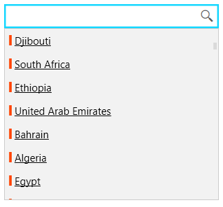
<Rectangle Fill="OrangeRed" Width="3" Height="12"/>
<TextBlock Text="{Binding Name}" Margin="3 0 0 0" TextDecorations="Underline" />
</StackPanel>
</DataTemplate>
</telerik:RadAutoSuggestBox.ItemTemplate>
</telerik:RadAutoSuggestBox>
Figure 1: Custom ItemTemplate
The ItemTemplateSelector allows you to choose a different DataTemplate for each item in the ItemsSource, based on a condition.
Example 2: Implementing the template selector
public class AutoSuggestBoxItemTemplateSelector : DataTemplateSelector
{
public DataTemplate DefaultTemplate { get; set; }
public DataTemplate AlternateTemplate { get; set; }
public override DataTemplate SelectTemplate(object item, DependencyObject container)
{
var dataItem = (CountryInfo)item;
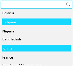
if (dataItem.Name.Equals("Bulgaria"))
{
return this.AlternateTemplate;
}
return this.DefaultTemplate;
}
}
Example 3: Setting ItemTemplateSelector
<telerik:RadAutoSuggestBox x:Name="radAutoSuggestBox" TextMemberPath="Name">
    <telerik:RadAutoSuggestBox.ItemTemplateSelector>
        <local:AutoSuggestBoxItemTemplateSelector>
            <local:AutoSuggestBoxItemTemplateSelector.DefaultTemplate>
                <DataTemplate>
                    <TextBlock Text="{Binding Name}" FontWeight="Bold" />
                </DataTemplate>
            </local:AutoSuggestBoxItemTemplateSelector.DefaultTemplate>
            <local:AutoSuggestBoxItemTemplateSelector.AlternateTemplate>
                <DataTemplate>
                    <Border Background="#15D7FF" Padding="4">
                        <TextBlock Text="{Binding Name}" Foreground="White" />
                    </Border>
                </DataTemplate>
            </local:AutoSuggestBoxItemTemplateSelector.AlternateTemplate>
        </local:AutoSuggestBoxItemTemplateSelector>
    </telerik:RadAutoSuggestBox.ItemTemplateSelector>
</telerik:RadAutoSuggestBox>
Figure 2: Custom ItemTemplateSelector
The following example shows how to setup a basic RadAutoSuggestBox in order to test the ItemTemplate features.
Example 4: Creating data model for the items
public static class CountryDataProvider
{
    public static List<CountryInfo> Countries { get; set; }

    static CountryDataProvider()
    {
        Countries = new List<CountryInfo>();
        var cultures = CultureInfo.GetCultures(CultureTypes.SpecificCultures);
        foreach (CultureInfo culture in cultures)
        {
            var regionInfo = new RegionInfo(culture.LCID);
            if (!Countries.Any(x => x.Name.Equals(regionInfo.EnglishName)))
            {
                Countries.Add(new CountryInfo() { Name = regionInfo.EnglishName });
            }
        }
    }
}

public class CountryInfo
{
    public string Name { get; set; }
}
Example 5: Populating the control with data
public MainWindow()
{
    InitializeComponent();
    this.radAutoSuggestBox.ItemsSource = CountryDataProvider.Countries;
}
Drop Down Settings
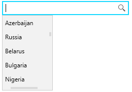
The RadAutoSuggestBox control provides few properties to change the drop down default sizes - MaxDropDownHeight, MaxDropDownWidth and MinDropDownWidth.
Example 6: Setting drop down sizes
<telerik:RadAutoSuggestBox MaxDropDownHeight="150" MaxDropDownWidth="100"
Figure 3: Custom drop down sizes
Additionally, you can manually open or close the drop down via the IsDropDownOpen property of RadAutoSuggestBox.