Visual Structure
This section defines the terms and concepts used in the scope of TabControl that you have to get familiar with prior to continuing with the rest of the article. They can also be helpful in order to describe your issue better when contacting our support service. Below you can see snapshots and explanations of the main states and visual elements of the standard TabControl controls.
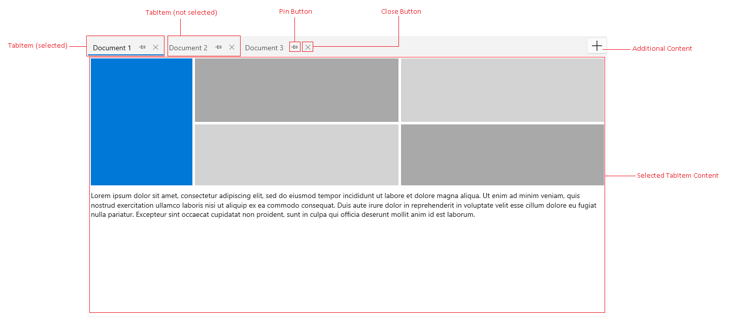
TabItem—A tab containing a header and content. Selecting a tab will load its content into the Selected TabItem Content area.
Pin Button—A button displayed in the header of the TabItem that pin/unpin the associated tab.
Closes Button—A button displayed in the header of the TabItem that closes the associated tab.
Additional Content—An additional presenter that allows you to include any custom UI at the end of the tabstrip area.
Selected TabItem Content—The content area where the visual content of the selected tab is loaded.
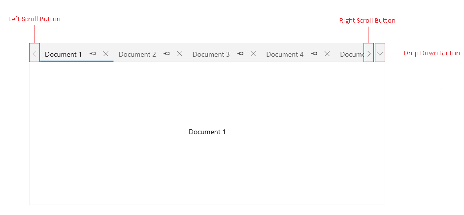
Left and Right Scroll Buttons—Those buttons are displayed when there is not enough space for the tab items to fit into the tabstrip area. They scroll the currently visible tabs, left and right.
Drop Down Button—It opens a list with all tab items.