Visual Structure
The following topic describes all visual elements and terms used in a standard RadRangeSlider control.
Components
The RadRangeSlider control consists of one RangeSliderPrimitive control and two ScalePrimitive controls. Each of these controls could be used as a seperate control.
Elements
These are all visual elements in a standard RadRangeSlider control:
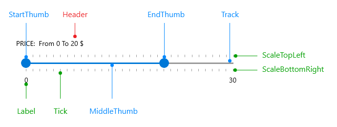
- ScaleBottomRight: This scale is visualized at the bottom when the orientation of the slider is horizontal, and at right when the orientation is verical. It can be styled through the BottomRightScaleStyle property of the RadRangeSlider.
- ScaleTopLeft: This scale is visualized at the top when the orientation of the slider is horizontal, and at left when the orientation is verical. It can be styled through the TopLeftScaleStyle property of the RadRangeSlider.
- StartThumb: This thumb indicates the start of the selected range - associated with the SelectionStart property.
- EndThumb: This thumb indicates the end of the selected range - associated with the SelectionEnd property.
- MiddleThumb: This thumb marks the area between the SelectionStartThumb and SelectionEndThumb.
- Track: It represents the track element along
- Label: This is the visual representation of the Minimum and Maximum values on the scale.
- Header: The header of the RadRangeSlider control.
Tooltips
The RadRangeSlider control also visualizes several tooltips:
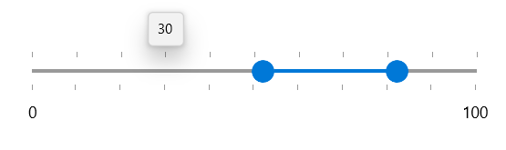
Value Tooltip
Displayed when the pointer enters the scale - shows the value corresponding the current position of the pointer.
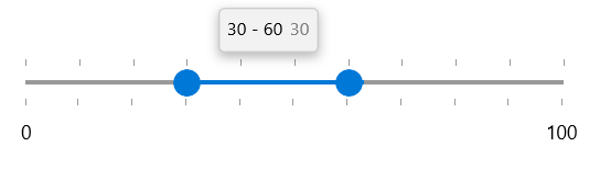
Range Tooltip
Displayed when the user changes the selection range. The visual structure of the tooltip displays the start, end values, and their difference when the user drags the left, right or the middle thumb.