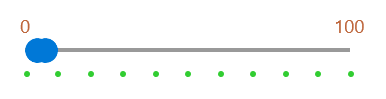
Styling
Customize ScalePrimitive Controls
To style the ScalePrimitive control we can create custom styles targeting ScalePrimitive object and modify its properties.
You can access the ScalePrimitive control through an alias pointing to the Telerik.UI.Xaml.Controls.Primitives namespace:
xmlns:primitives="using:Telerik.UI.Xaml.Controls.Primitives"
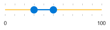
Example 1: Style ScalePrimitive Control
<Window.Resources>
    <Style TargetType="primitives:ScalePrimitive" x:Key="ScaleStyle">
        <Setter Property="LabelPlacement" Value="None"/>
        <Setter Property="TickPlacement" Value="TopLeft"/>
        <Setter Property="TickTemplate">
            <Setter.Value>
                <DataTemplate>
                    <Ellipse Width="5" Height="5" Margin="0,5,0,0" Fill="LimeGreen"/>
                </DataTemplate>
            </Setter.Value>
        </Setter>
    </Style>

    <Style TargetType="primitives:ScalePrimitive" x:Key="ScaleStyle2">
        <Setter Property="LabelPlacement" Value="Center"/>
        <Setter Property="LabelStyle">
            <Setter.Value>
                <Style TargetType="TextBlock">
                    <Setter Property="Foreground" Value="#BE673D"/>
                    <Setter Property="FontSize" Value="15"/>
                </Style>
            </Setter.Value>
        </Setter>
        <Setter Property="TickPlacement" Value="None"/>
    </Style>
</Window.Resources>
You can access the RadRangeSlider control through an alias pointing to the Telerik.UI.Xaml.Controls.Primitives namespace:
xmlns:telerik="using:Telerik.UI.Xaml.Controls.Input"
Example 2: Set Scale Styles
<telerik:RadRangeSlider BottomRightScaleStyle="{StaticResource ScaleStyle}"
                                 TopLeftScaleStyle="{StaticResource ScaleStyle2}"
                                 Width="300" TickFrequency="10"/>
The result is:
Customize RangeSliderPrimitive Control
In this example we will demonstrate how to customize the thumbs of the control. The thumbs are customize throught the RangeSliderPrimitive control. We can create a custom style that targets the RangeSliderPrimitive class.
You can access the RangeSliderPrimitive control through an alias pointing to the Telerik.UI.Xaml.Controls.Primitives namespace:
xmlns:primitives="using:Telerik.UI.Xaml.Controls.Primitives"
Example 3: Style RangeSlider Thumbs
<Window.Resources>
    <Style TargetType="primitives:RangeSliderPrimitive" x:Key="PrimitiveStyle">
        <Setter Property="SelectionStartThumbStyle">
            <Setter.Value>
                <Style TargetType="Thumb">
                    <Setter Property="BorderThickness" Value="0"/>
                    <Setter Property="Background" Value="#FFCE5E"/>
                    <Setter Property="Width" Value="15"/>
                    <Setter Property="Height" Value="15"/>
                </Style>
            </Setter.Value>
        </Setter>
        <Setter Property="SelectionMiddleThumbStyle">
            <Setter.Value>
                <Style TargetType="Thumb">
                    <Setter Property="BorderThickness" Value="0"/>
                    <Setter Property="Background" Value="#80D6F4"/>
                    <Setter Property="Height" Value="11"/>
                </Style>
            </Setter.Value>
        </Setter>
        <Setter Property="SelectionEndThumbStyle">
            <Setter.Value>
                <Style TargetType="Thumb">
                    <Setter Property="BorderThickness" Value="0"/>
                    <Setter Property="Background" Value="#BE673D"/>
                    <Setter Property="Width" Value="15"/>
                    <Setter Property="Height" Value="15"/>
                </Style>
            </Setter.Value>
        </Setter>
    </Style>
</Window.Resources>
Example 4: Set SliderPrimitiveStyle Styles
<telerik:RadRangeSlider SelectionStart="30" SelectionEnd="50" SliderPrimitiveStyle="{StaticResource PrimitiveStyle}"
                                 Width="300" TickFrequency="10"/>
Customize RangeSlider Track
The track of the slider is represent by a RangeTrackPrimitive control. To customized it, we can create implicit style targeting RangeTrackPrimitive element.
You can access the RangeTrackPrimitive control through an alias pointing to the Telerik.UI.Xaml.Controls.Primitives namespace:
xmlns:rangeSliderPrimitives="using:Telerik.UI.Xaml.Controls.Primitives.RangeSlider"
Example 5: Customize RangeSlider Track
<telerik:RadRangeSlider SelectionStart="30" SelectionEnd="50" Width="300" TickFrequency="10">
    <telerik:RadRangeSlider.Resources>
        <Style TargetType="rangeSliderPrimitives:RangeTrackPrimitive">
            <Setter Property="Background" Value="#FFCE5E"/>
        </Style>
    </telerik:RadRangeSlider.Resources>
</telerik:RadRangeSlider>
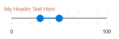
Customize RangeSlider Header Control
To customize the header part of the control, we can use its HeaderStyle property. We can create custom Style targeting ContentControl element.
Example 6: Customize RangeSlider Track
<Window.Resources>
    <Style TargetType="ContentControl" x:Key="HeaderStyle">
        <Setter Property="Foreground" Value="#BE673D"/>
        <Setter Property="FontSize" Value="15"/>
    </Style>
</Window.Resources>
Then we can set the HeaderStyle property to the custom Style.
Example 7: Customize RangeSlider Track
<telerik:RadRangeSlider SelectionStart="30" SelectionEnd="50" HeaderStyle="{StaticResource HeaderStyle}" Header="My Header Text Here"
                                 Width="300" TickFrequency="10" Margin="50"/>
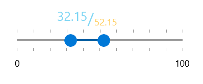
Customize RangeToolTip
You can style the RangeToolTip by setting explicit style in the Resources of the RadRangeSlider. You can change the properties that affect the default style of the tooltip or you can retemplate the control. The following code snippet demonstrates how to set a custom template:
You can access the RangeToolTip control through an alias pointing to the Telerik.UI.Xaml.Controls.Primitives namespace:
xmlns:rangeSliderPrimitives="using:Telerik.UI.Xaml.Controls.Primitives.RangeSlider"
Example 8: Customize RangeSlider TooltTips
<telerik:RadRangeSlider SelectionStart="30" SelectionEnd="50" Width="300" TickFrequency="10">
    <telerik:RadRangeSlider.Resources>
        <Style TargetType="rangeSliderPrimitives:RangeToolTip">
            <Setter Property="Template">
                <Setter.Value>
                    <ControlTemplate TargetType="rangeSliderPrimitives:RangeToolTip">
                        <StackPanel Orientation="Horizontal" Margin="10" HorizontalAlignment="Center" VerticalAlignment="Center">
                            <TextBlock FontSize="20" VerticalAlignment="Top" Foreground="#80D6F4" Text="{Binding StartValue}"/>
                            <TextBlock FontSize="25" VerticalAlignment="Center" Foreground="#80D6F4" Text="/"/>
                            <TextBlock FontSize="15" VerticalAlignment="Bottom" Foreground="#FFCE5E" Text="{Binding EndValue}" />
                        </StackPanel>
                    </ControlTemplate>
                </Setter.Value>
            </Setter>
        </Style>
    </telerik:RadRangeSlider.Resources>
</telerik:RadRangeSlider>