Key Properties
The purpose of this help article is to show you the key properties of the RadGridSplitter control.
You can access the RadGridSplitter control through an alias pointing to the Telerik.UI.Xaml.Controls.Primitives namespace:
xmlns:primitives="using:Telerik.UI.Xaml.Controls.Primitives"
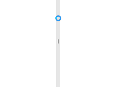
Gripper Foreground
Through the GripperForeground property you can control the color of the gripper part of the RadGridSplitter.
Example 1: Set the Gripper Foreground
<primitives:RadGridSplitter GripperForeground="Red" />

Element
Through the Element property you can control the which is displayed in the gripper part of the RadGridSplitter.
Example 2: Set the Gripper Element
<primitives:RadGridSplitter>
    <primitives:RadGridSplitter.Element>
        <Rectangle Height="20" Width="7" Fill="Yellow" />
    </primitives:RadGridSplitter.Element>
</primitives:RadGridSplitter>

Resize Behavior
Through the ResizeBehavior property you can control which columns or rows are resized relative to the column or row for which the GridSplitter control is defined. It can be set to one of the following values:
- BasedOnAlignment: Space is redistributed based on the value of the HorizontalAlignment and VerticalAlignment properties.
- CurrentAndNext: For a horizontal GridSplitter, space is redistributed between the row that is specified for the GridSplitter and the next row that is below it. For a vertical GridSplitter, space is redistributed between the column that is specified for the GridSplitter and the next column that is to the right.
- PreviousAndCurrent: For a horizontal GridSplitter, space is redistributed between the row that is specified for the GridSplitter and the next row that is above it. For a vertical GridSplitter, space is redistributed between the column that is specified for the GridSplitter and the next column that is to the left.
- PreviousAndNext: For a horizontal GridSplitter, space is redistributed between the rows that are above and below the row that is specified for the GridSplitter. For a vertical GridSplitter, space is redistributed between the columns that are to the left and right of the column that is specified for the GridSplitter.
Resize Direction
Through the ResizeDirection property you can control whether the GridSplitter control resizes rows or columns. It has the following values:
- Auto: Space is redistributed based on the values of the HorizontalAlignment, VerticalAlignment, ActualWidth, and ActualHeight properties of the GridSplitter.
- Columns: Space is redistributed between columns.
- Rows: Space is redistributed between rows.
Gripper Cursor
The control also allows you to specify the cursor which will be displayed when hovering over the gripper element. You can set this via the GripperCursor property.
Example 3: Set the Gripper Cursor
<primitives:RadGridSplitter GripperCursor="Wait" />
Cursor Behavior
Via the CursorBehavior property you can control when the cursor changes. There are two possible values:
- ChangeOnSplitterHover: The cursor will change when the mouse hovers over the whole splitter control. This is the default value.
- ChangeOnGripperHover: The cursor will be updated only when the mouse hovers over gripper part of the splitter control.
Example 4: Set the Gripper Cursor
<primitives:RadGridSplitter CursorBehavior="ChangeOnGripperHover" />