Segmented Indicators
Segmented indicators allow for defining a collection of segments to visualize multiple ranges on the scale.
SegmentedGaugeIndicator
The SegmentedGaugeIndicator class is the base abstract class of the segmented indicators. It does not have any visual representation initially and users are expected to populate the indicator with BarIndicatorSegment objects.
SegmentedGaugeIndicator class inherits from the GaugeIndicator class - See the inherited properties
The SegmentedLinearGaugeIndicator and SegmentedRadialGaugeIndicator can be used in the RadLinearGauge and RadRadialGauge respectively. They do not introduce any new properties and simply implement the abstract logic of their base class by arranging their segments in linear and circular manners.
BarIndicatorSegment Properties
- Length (double): This is the proportional length of the segment. The actual length of each segment will be determined by the Length divided by the sum of all the segments' lengths.
- Thickness (double): This is the thickness of the segment. The concept is the same as the thickness of a line, or a circle.
- Stroke (Brush): This is the color of the segment. This property is of type Brush.
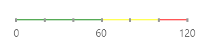
Segmented Linear Gauge
Example 1 demonstrates how to implement a RadLinearGauge with a SegmentedLinearGaugeIndicator and three colored BarIndicatorSegments.
Example 1: Segmented Linear Gauge
<Grid xmlns:dataVisualization="using:Telerik.UI.Xaml.Controls.DataVisualization">
    <dataVisualization:RadLinearGauge LabelStep="60" TickStep="20" MaxValue="120" Width="200">
        <dataVisualization:SegmentedLinearGaugeIndicator Value="120">
            <dataVisualization:BarIndicatorSegment Stroke="Green" Length="3"/>
            <dataVisualization:BarIndicatorSegment Stroke="Yellow" Length="2" />
            <dataVisualization:BarIndicatorSegment Stroke="Red" Length="1" />
        </dataVisualization:SegmentedLinearGaugeIndicator>
    </dataVisualization:RadLinearGauge>
</Grid>
Figure 1: Segmented Linear Gauge
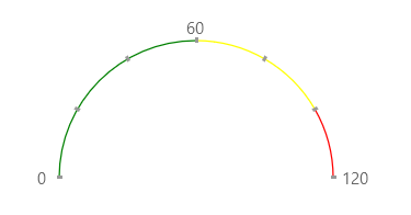
Segmented Radial Gauge
Example 2 demonstrates how to implement a RadRadialGauge with a SegmentedRadialGaugeIndicator and three colored BarIndicatorSegments.
Example 2: Segmented Radial Gauge
<telerik:RadRadialGauge LabelStep="60" TickStep="20" MaxValue="120" LabelRadiusScale="1.10" Width="200">
    <telerik:SegmentedRadialGaugeIndicator Value="120">
        <telerik:BarIndicatorSegment Stroke="Green" Length="3"/>
        <telerik:BarIndicatorSegment Stroke="Yellow" Length="2" />
        <telerik:BarIndicatorSegment Stroke="Red" Length="1" />
    </telerik:SegmentedRadialGaugeIndicator>
</telerik:RadRadialGauge>
Figure 2: Segmented Radial Gauge