Axis
RadDataBar provides an additional component that allows you display a data axis.
The RadHorizontalDataAxis and RadVerticalDataAxis are part of the data bar suite and allow you to display a stand alone axis control next to the data bar visualization. The axis size should be synced with the size of the data bar in order to correctly match the value range.
You can access the RadDataBar controls through an alias pointing to the Telerik.UI.Xaml.Controls.DataVisualization namespace: xmlns:dataVisualization="using:Telerik.UI.Xaml.Controls.DataVisualization"
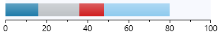
Example 1: Using RadHorizontalDataAxis
 <Grid Width="300" Height="50" Margin="20">
    <Grid.RowDefinitions>
        <RowDefinition />
        <RowDefinition Height="Auto"/>
    </Grid.RowDefinitions>
    <dataVisualization:RadStackedDataBar x:Name="axisDataBar" Background="#F7F9FE" />
    <dataVisualization:RadHorizontalDataAxis Grid.Row="1" Step="10" />
</Grid>
Example 2: Setting the RadStackedDataBar ItemsSource
public MyUserControl()
{
    InitializeComponent();
    this.axisDataBar.ItemsSource = new List<double>() { -20, 16, 20, 12, 32 };
}
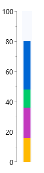
Example 3: Using RadVerticalDataAxis in Grid
<Grid Margin="20">
    <Grid.ColumnDefinitions>
        <ColumnDefinition Width="Auto"/>
        <ColumnDefinition  Width="*"/>
    </Grid.ColumnDefinitions>
    <dataVisualization:RadVerticalDataAxis Step="10"  Height="300"/>
    <dataVisualization:RadStackedDataBar  x:Name="axisDataBar" Width="300" HorizontalAlignment="Left" Height="20" Margin="-130 0 0 0" Background="#F7F9FE" Grid.Column="1"   RenderTransformOrigin="0.5,0.5">
        <dataVisualization:RadStackedDataBar.RenderTransform>
            <RotateTransform Angle="-90" />
        </dataVisualization:RadStackedDataBar.RenderTransform>
    </dataVisualization:RadStackedDataBar>
</Grid>
Example 3: Using RadVerticalDataAxis in StackPanel
<StackPanel  Height="300" Orientation="Horizontal">
    <dataVisualization:RadVerticalDataAxis Step="10" />
    <dataVisualization:RadStackedDataBar x:Name="stackedDataBar"  Background="#F7F9FE" Height="20" Width="300"
                                         ItemsSource="{Binding Items}"
                                         ValuePath="Val" RenderTransformOrigin="0.5,0.5"
                                         Margin="-120 0 0 0">
        <dataVisualization:RadStackedDataBar.RenderTransform>
            <RotateTransform Angle="-90" />
        </dataVisualization:RadStackedDataBar.RenderTransform>
    </dataVisualization:RadStackedDataBar>
</StackPanel>
The data axis control provides the following public properties that can be used in order to modify its appearance:
LabelStep: Indicates that one out of
nticks should have a label wherenis the value of the property.MajorTickLength: Controls the size of the major ticks.
Minimum and Maximum: The start and end value for the axis.
MinorTickLength: Controls the size of the minor ticks.
Step: Indicates the step of the ticks. For instance, if the minumum is "-20" and the maximum is "10", and the step is "3" - ticks will be visualized to indicate -20, -17, -14 .. 4, 7, 10.
Stroke: The stroke brush for the axis.
-
TicksDistance: Specifies a value indicating that every axis tick should be placed at least
npixels away from the next one, wherenis the value of the property. Use when you have too much data to display on the axis to control the number of ticks shown.The TickDistance property has a smaller priority than Step. If both Step and TickDistance are set - the axis algorithm that distributes the ticks will only take into consideration the Step property. These two properties should not be used in conjunction.